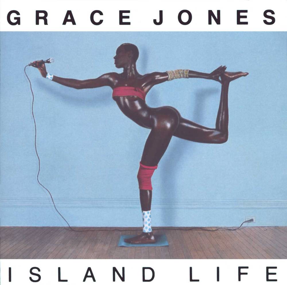
Grace Jones
Island Life, 1985
Like all meaningful design, album art is so much more than just packaging. It is a crucial piece of how a band, album, and genre are perceived, and a major contributing factor to the culture of music as a whole in the postwar era.
The history of records began in 1857, when Eduardo-Lean Scott created the phonautograph, which used a vibrating pen to record sounds onto paper discs. The idea was furthered by inventor Emilie Berliner, who invented the hand-wound gramophone in 1867 to play vinyl records. Thomas Edison then used this concept to invent a machine that could replay the recorded sounds, similarly using a stylus to cut grooves into tin. Over the following decades, the record went through a series of changes in size until Columbia Records released their 33 1/3 RPM records on polyvinyl chloride in 1948. This design prevailed until the invention of CDs in 1982, and the eventual switch to digital downloads. Still, thanks in part to the significance assigned to the physical album and cover as pieces of art, records remain an important collectible item today.
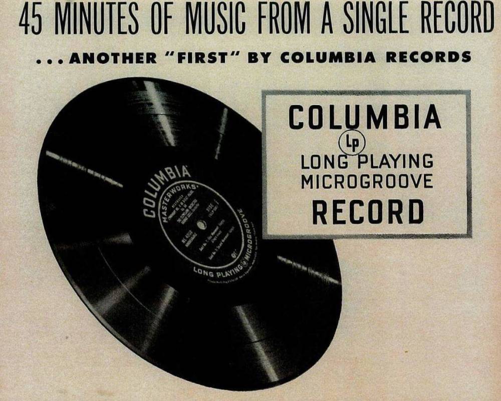
Columbia Records
33 1/3 RPM Records, 1948
Until the prewar era, records were typically sold in brown paper or cardboard sleeves. The first “album” was invented by German record company Odeon, who distributed Tchaikovsky’s The Nutcracker Suite on four double-sided discs and sold them packaged together. The earliest work of album art came about in 1938, when Columbia Records hired its first art director, Alex Steinweiss. Steinweiss’ illustrated covers for musicians like Beethoven led to a huge soar in sales, and in turn began the tradition of decorated album covers that we know today. With the invention of the 33 1/3 RPM records in the late 1940s a new format of packaging was required, at which time record companies began using a fold-over sleeve, a format that allowed for a new era of experimentation in album art.

Alex Steinweiss
Columbia Masterworks, Beethoven Symphony No. 3 in e Flat Major opus 55 Eroica, 1949
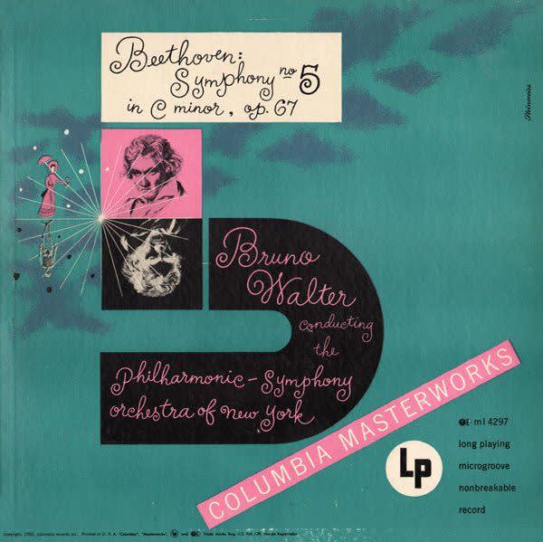
Alex Steinweiss
Cover for Beethoven Symphony No. 5, 1949

Odeon Records
The first massively influential record art came about with Nat King Cole’s 'The King Cole Trio' album, which featured images of a double bass, guitar, and keyboard under a gold crown amidst a bold red background. The records housed inside spent most of 1945 on the Billboard Best Selling Popular Record Albums chart, demonstrating the large-scale reach and influence that cover designs would become. In the following years, record companies would begin utilizing talented artists for cover designs, and effectively kickstarting the careers of many including Andy Warhol, Roger Dean, and Burt Goldblatt. Eventually photography and typography also took on major roles in the marketing of records. Post-World War II, an edgy modernism was introduced on album covers, and it became fashionable for musicians of the 1960s to invite old art school friends to design their cover art. Many of these artists would go on to develop the imagery associated with rock and roll, and their designs would solidify the intersections of art, music, and fashion that, in turn, spurred subcultures worldwide.

The King Cole Trio
Vol. 1, 1943

Andy Warhol
Gioachino Rossini, William Tell Overture, Semiramide Overture, 1953
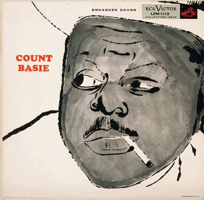
Andy Warhol
Count Basie, 1955
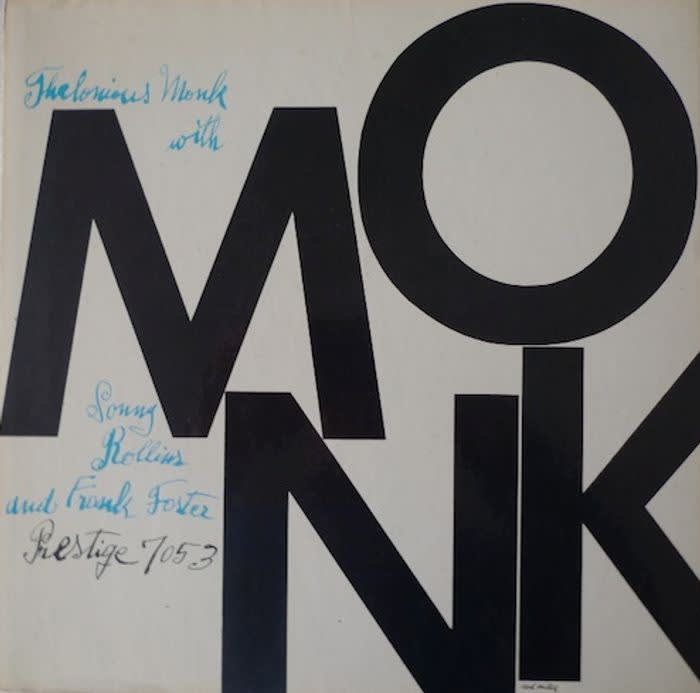
Andy Warhol
Thelonious Monk, 1956
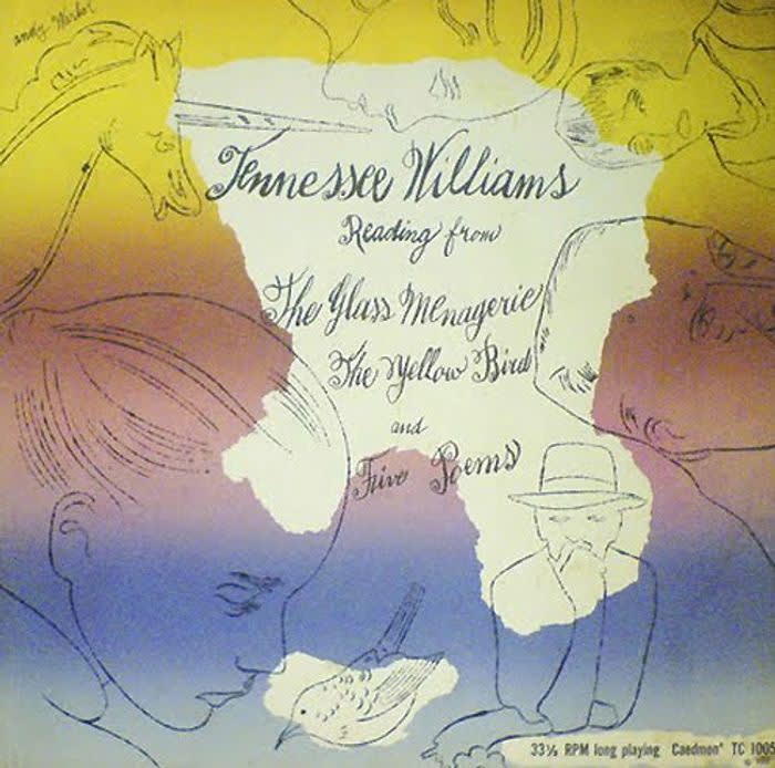
Andy Warhol
Tennessee Williams, Reading From the Glass Menagerie, 1960
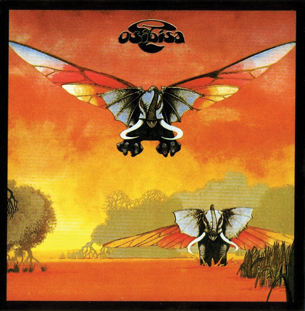
Roger Dean
Osibisa, 1971
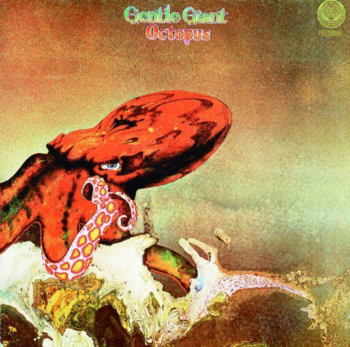
Roger Dean
Gentle Giant, Vertigo, 1972

Roger Dean
Fragile, Yes, Atlantic, 1972
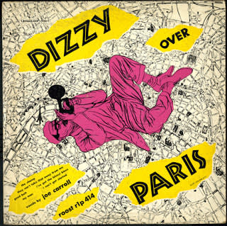
Burt Goldblatt
Dizzy Gillespie, Over Paris, 1953
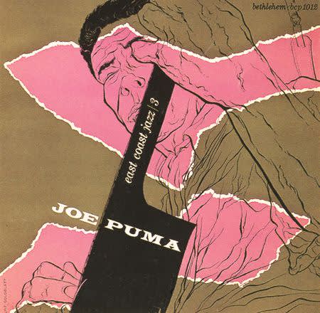
Burt Goldblatt
Joe Puma, 1954
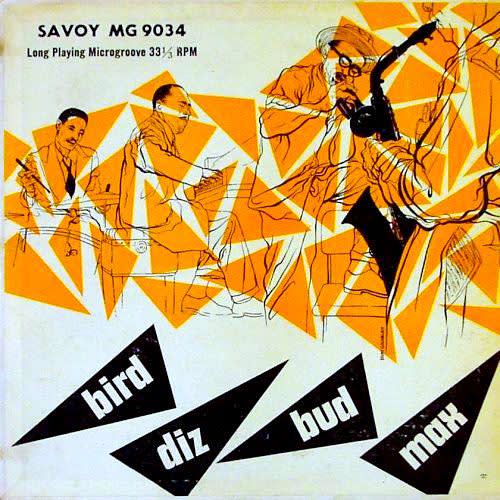
Burt Goldblatt
Bird Diz Bud Max, 1950-60s
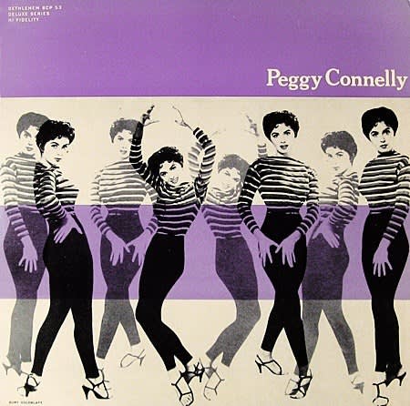
Burt Goldblatt
Peggy Connelly, 1960s
Despite the prevalence of digital downloads in the music industry today, album art has created a culture that refuses to be left behind. The iconic and long-lasting collaborations between artists and musicians created records that are still widely distributed today. One of the most exemplary albums of the 1960s, 'Bob Dylan’s Greatest Hits' used designer Milton Glaser of Push Pin Studios to create a psychedelic design that would go on to define the decade. The cover of the album featured a photograph of Dylan taken by Rowland Scherman at a 1965 concert, as well as Glaser’s famous poster. The album won a Grammy award in 1967 for best album cover, and would go on to be cemented in the collective history of rock and roll culture. Glaser would also design the album sleeve for the 1968 album 'Music From Big Pink' positioning Dylan’s backing band at center stage. The cover art was taken from Dylan’s own original painting, furthering the deeply intertwined relationship between music and art.
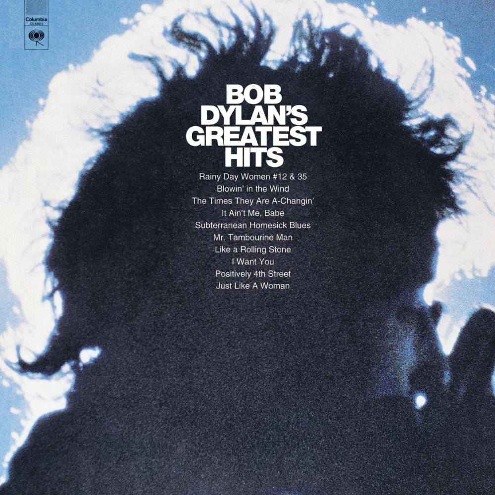
Milton Glaser
Bob Dylan's Greatest Hits, 1960s
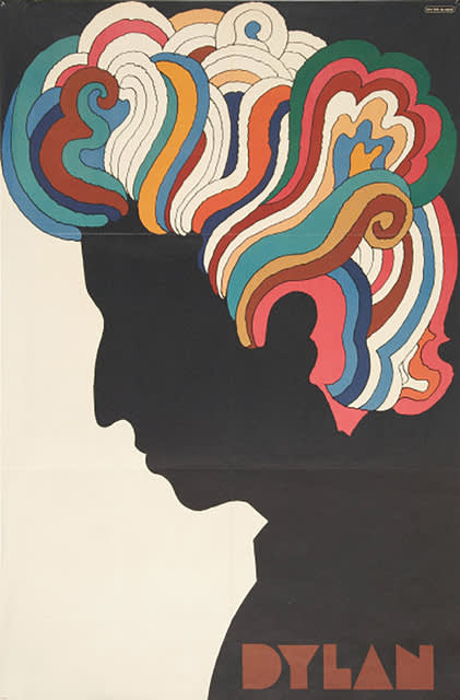
Milton Glazer
Bob Dylan Poster, 1967
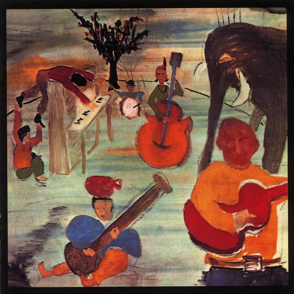
Milton Glaser
The Band, Music From Big Pink, 1968
Photography, too, has been a widely influential medium in the world of album art since the 1960s. Simon and Garfunkel’s 1968 album 'Bookends,' by example, featurs a portrait of the musicians taken by Richard Avedon, with Avedon himself reflected in Simon’s eyes, positioning the artist as a crucial player in the success of the album. Similarly, the 1984 Bruce Springsteen album 'Born in the USA' utilized celebrated photographer Annie Leibovitz. Featuring the singer in a white t-shirt and blue jeans, set amongst the backdrop of an American flag, Leibovitz’s work perfectly captures Springsteen’s own style and Americana aesthetic.
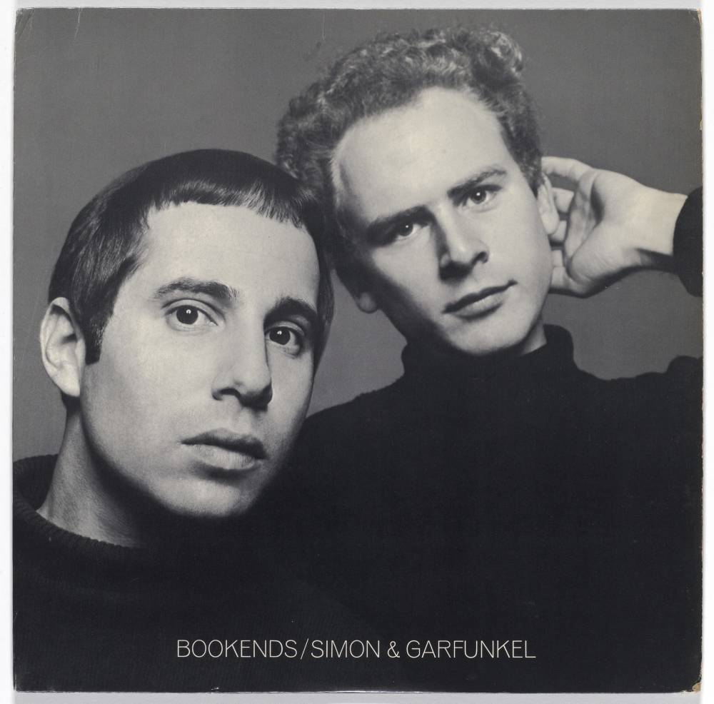
Richard Avedon
Simon & Garfunkel, Bookends, 1968
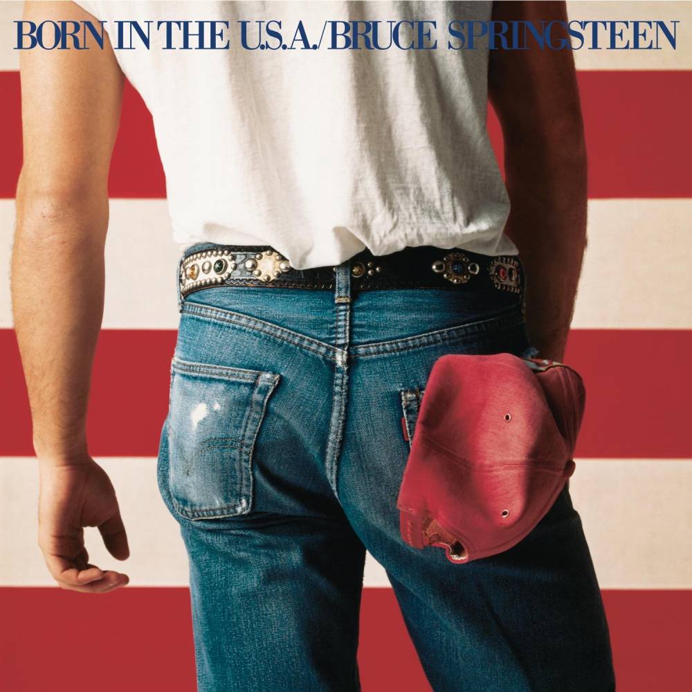
Annie Leibovitz
Bruce Springsteen, Born in The U.S.A., 1984
Another iconic image of the 1960s utilized the era's most famous pop artist, Andy Warhol, and a neverbeforeseen printing technique. The 1967 album 'The Velvet Underground and Nico' featured a Warhol banana print which could be peeled back like a sticker, revealing an image of the fruit also underneath. The banana would go on to become an international symbol of Warhol’s work, widely reproduced for merchandise in the typical pop art fashion. Warhol also leant his creative genius to the 1971 Rolling Stones album 'Sticky Fingers,' which similarly utilized sex appeal and interactive elements to generate sales. The cover featuring an image of a man’s crotch with a bold, functional zipper would go on to define the Rolling Stones—and rock itself—as salacious, risqué, and badly behaved.
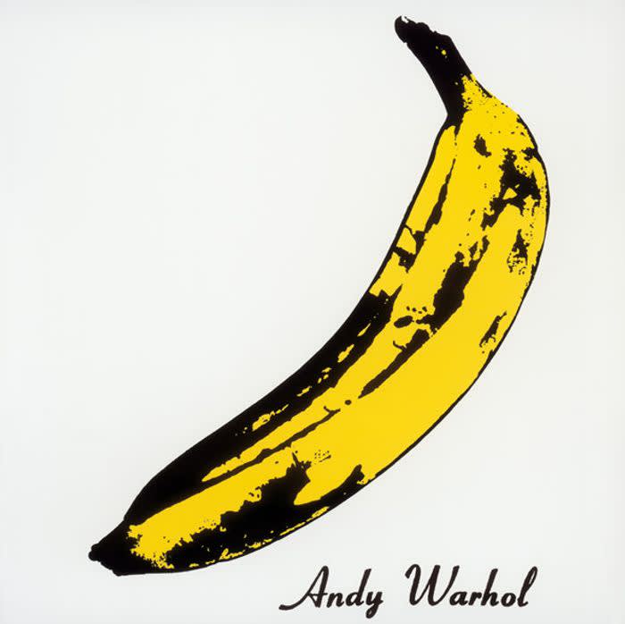
Andy Warhol
The Velvet Underground & Nico, 1967
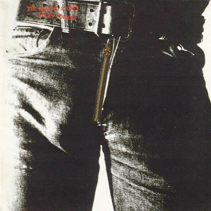
Andy Warhol
The Rolling Stones, Sticky Fingers, 1971
The 1980s brought a new wave of creativity to album designs. One of the decade’s most celebrated experimental bands, the Talking Heads required a new approach to cover design for their fifth studio album, 'Speaking in Tongues'. David Byrne scouted artist Robert Raushenberg who based the album's cover art off of his own 1967 sculptural work, titled Revolver. The resulting album was composed of three clear vinyls with vacu-sealed packaging. Each vinyl consisted of colored images superimposed atop one another, so that when packaged together the images obscured one another. In 1981, punk band The Offs commissioned then-unknown artist and friend Jean-Michel Basquiat for their album First Record. The resulting image was a black and white cartoon image of a man with a crown of thorns floating above his head, and the band’s name scribbled in three places across the cover. Basquiat’s design would become a crucial element in the marketing of the album as well as the solidification of the punk genre.
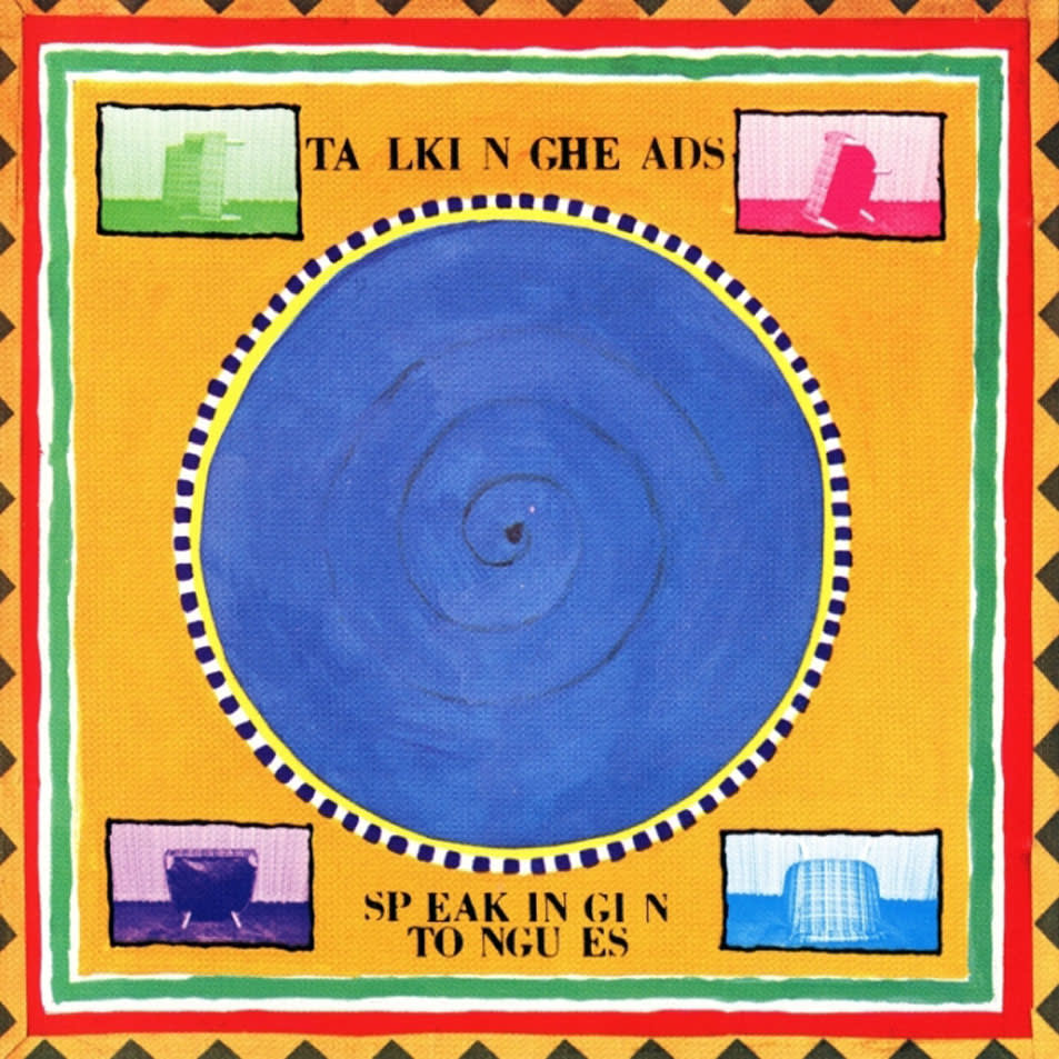
Robert Raushenberg
Talking Heads Speaking in Tongues, 1983

Jean-Michel Basquiat
The Offs, 1981
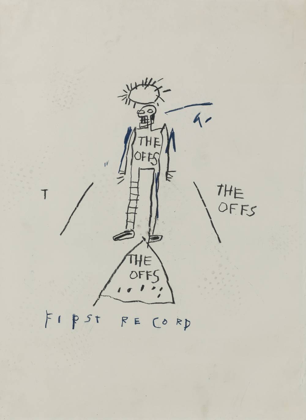
Jean-Michel Basquiat
Untitled (The Offs), 1981
The alternative rock band Sonic Youth, who released 15 albums between 1983 and 2009, wisely utilized a series of artists and styles to create album covers that would be endlessly recreated as posters, t-shirts, and other collectible merchandise, allowing their band to live on for decades. Their 1988 'Daydream Nation' cover utilized a modified version of painter Gerhard Richter’s 'Two Candles' work, while the band's 1990 album 'Goo' used a completely different style; a black and white comic book illustration by Raymon Pettibon, which was based on a newspaper image of key witnesses in the 1966 Moors Murders trial. The juxtaposition of cheery comic book style with dark dialogue allowed this cover to gain everlasting notoriety that would become widely parodied. For thier 2004 'Sonic Nurse' album, the band recruited artist Richard Prince, using a design from Prince’s famous Nurse series. The collaboration with this wide range of artists was a huge element in the popularity of Sonic Youth. Similar to the Richard Prince cover, contemproary rock band Red Hot Chili Peppers used a famous symbol by artist Damien Hirst for their 2011 'I’m With You cover,' an image of a pill with the album’s title written on it and a fly perched atop. Furthermore, the collaborative album 'We Love You…So Love Us' also uses an iconic symbol, Banksy’s 'Love is in the Air (Flower Thrower),' while the 1983 album 'I Cry for You' by Bobby “O” uses a recognizable Roy Lichtenstein image for its cover art. As history has shown, utilizing the symbols of specific artists allows the album another layer of meaning and puts the collaboration between musicians and artists at the forefront.
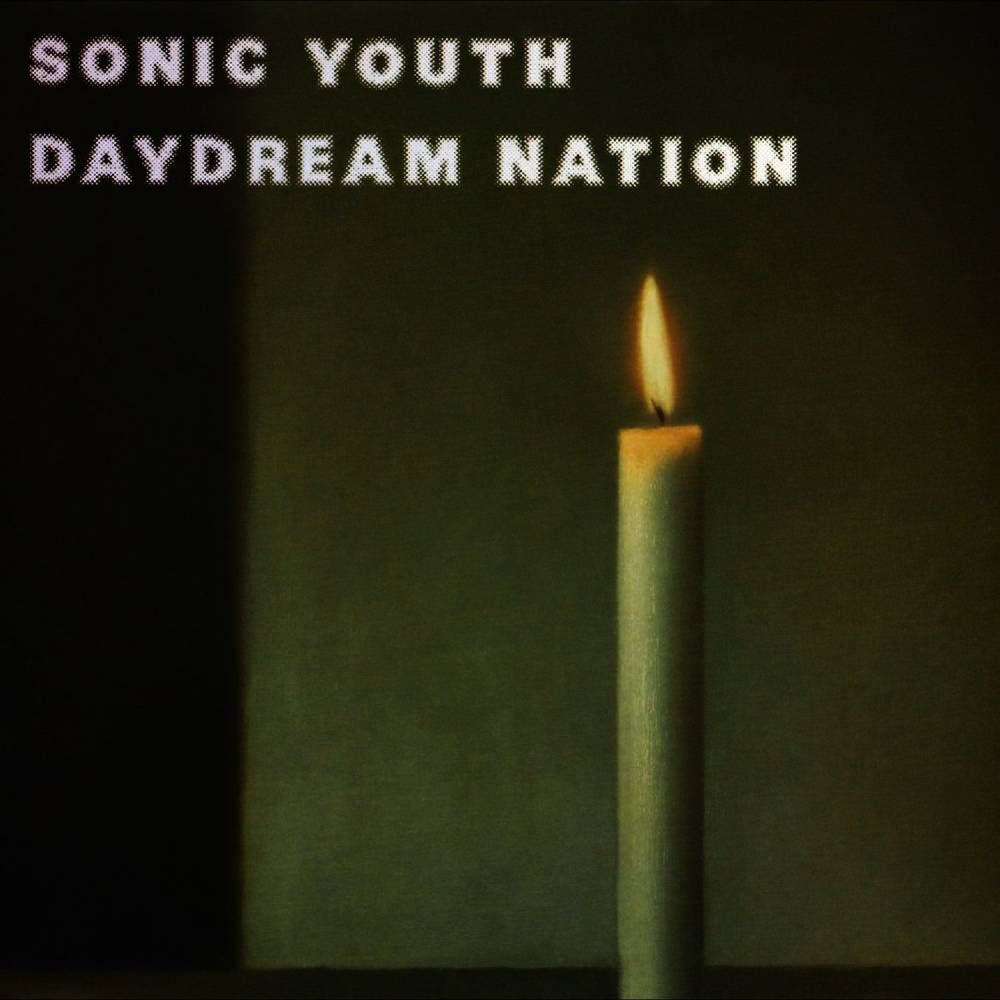
Gerhard Richter
Sonic Youth, Daydream Nation, 1988
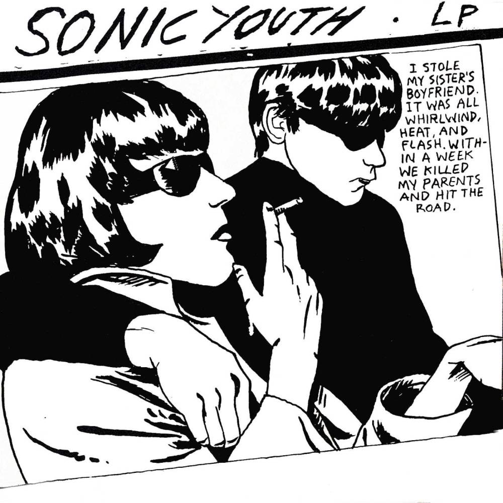
Raymon Pettibon
Sonic Youth, Goo, 1990

Richard Prince
Sonic Youth, Sonic Nurse, 2004

Damien Hirst
Red Hot Chili Peppers, I'm With You, 2011
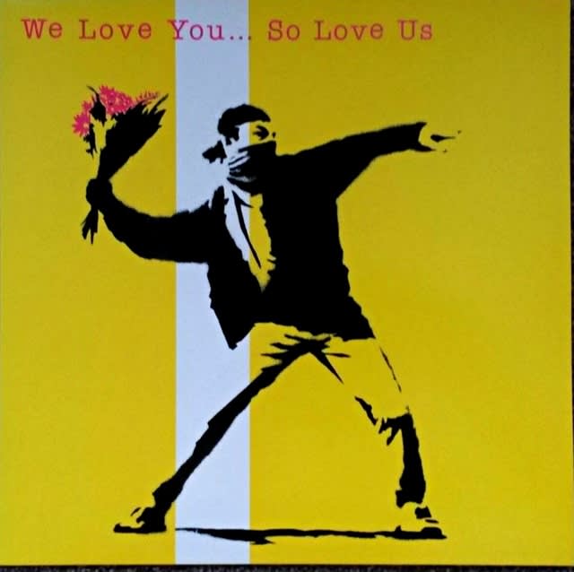
Banksy
Collaborative Album, We Love You…So Love Us, 2000

Banksy
Collaborative Album, We Love You…So Love Us, 2000
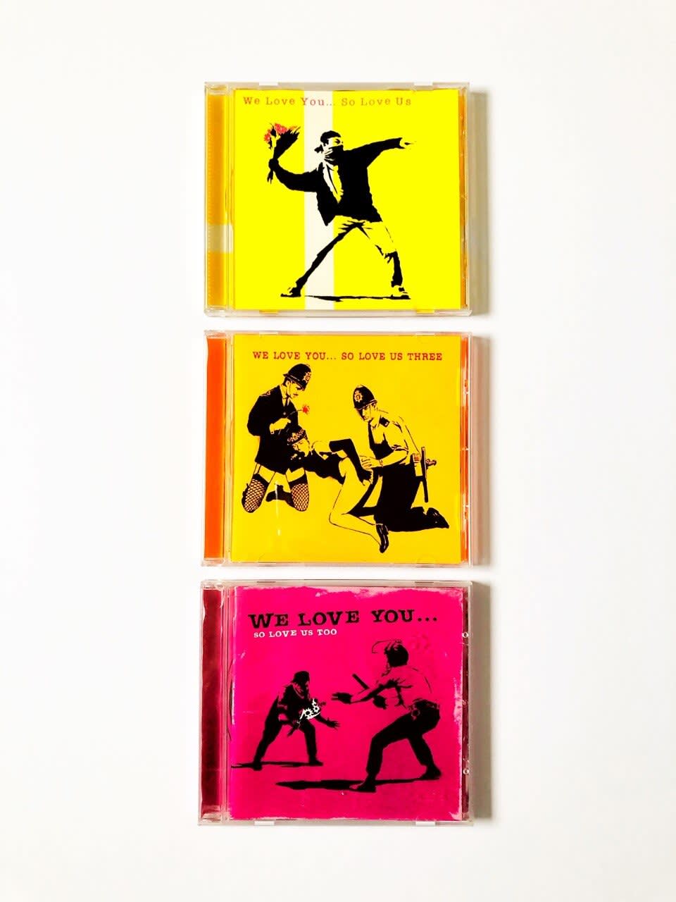
Banksy
Collaborative Album, We Love You…So Love Us, 2000

Roy Lichtenstein
I Cry For You Bobby O, 1983
The genre of Hip-Hop has been particularly important in recent decades in championing the collaboration between music genres as well as the art and fashion that represent their culture. Kanye West’s 2007 'Graduation' album features Murakami’s psychedelic, cartoon-inspired design on the cover, while Travis Scott and Kid Cudi’s 2020 album 'The Scotts' features the X-eyed characters associated with contemporary street artist KAWS. Similarly, Emanon’s 1986 album The Baby Beat Box features the archetypal cartoonish work of Keith Haring, while the 1994 Consolidated album Business of Punishment utilizes collagist Barbara Kruger’s bold typography combined with photography. Artists like Takashi Murakami and KAWS are known to intersect with the fashion world, particularly in streetwear. This subsection of fashion—and, subsequently, art—has important ties with the Rap and Hip-Hop genres of music, creating a collective subculture that relies as much on music as it does on the dress and style of its artists and fans, and the design of its album covers and merchandise. These elements of boldness, illustration, and color work together to create a distinct and modern vision of art.

Takashi Murakami
Kanye West, Graduation, 2007

KAWS
Travis Scott, Kid Cudi, THE SCOTTS, 2020

Keith Haring
The Baby Beat Box, 1986

Barbara Kruger
Consolidated, Business of Punishment, 1994
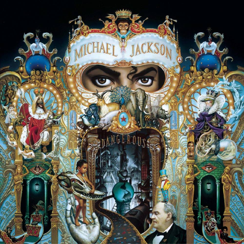
The world of Pop music is widely criticized for its unoriginality and lack of meaning, but many musicians and the artists they collaborate with are so much more than these accusations. Artists like Lady Gaga have channeled the visionary work of the pop art king, Andy Warhol, into their music, rebranding pop as a legitimate art form with a message despite—or in fact because of—its commercial ties. Collaborations like Lady Gaga and Jeff Koons for the singer's 2013 'ARTPOP' album, or Rihanna and Israeli artist Roy Nachum's partnership, cement the importance of Pop musci to both art and culture. Of course, these modern artists could not be where they are today without the king of Pop, Michael Jackson. Jackson’s 1991 'Dangerous' album cover by Mark Ryden, the “grandfather of pop surrealism,” demonstrated the unique cultures that can arise when musicians and artists come together under a common goal. Long live album art and the new possibilties unearthed by the dinstinct medium.
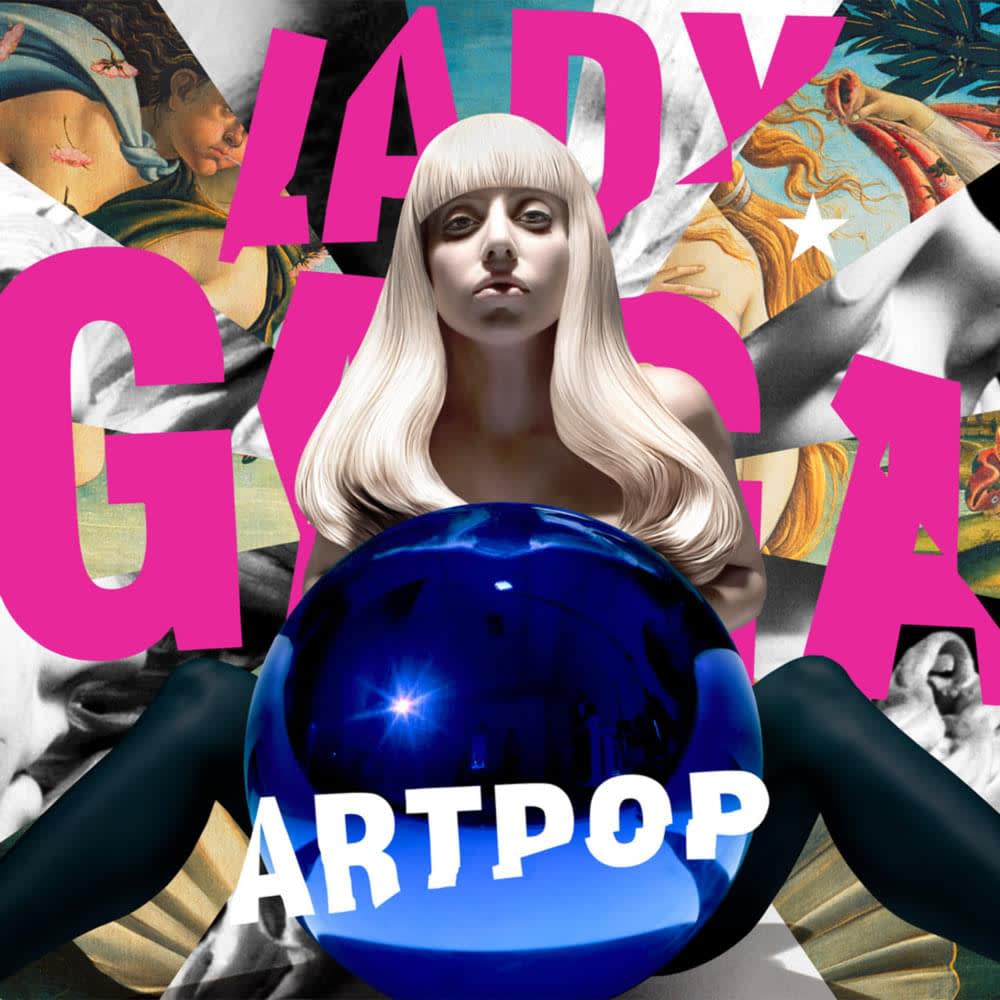
Jeff Koons
Lady Gaga, Art Pop, 2012

Roy Nachum
Rihanna, ANTI, 2016
