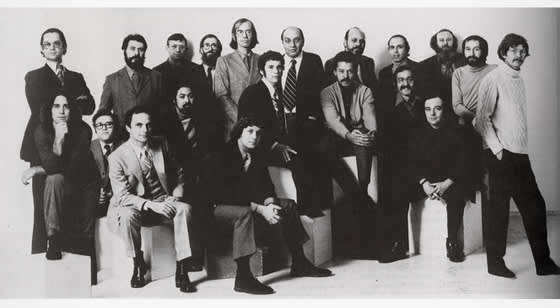
Push Pin Studios
Original Team of Designers
In the midst of the 1960s — one of the most monumental moments in America for art, music, politics, and activism—emerged the New York-based graphic design firm, Push Pin Studios. The group’s work had a defining influence on illustration and graphics of the time, and created some of the most recognizable commercial works of the decade. Drawing from a wide array of sources, the group reinvented graphic design by both rejecting the rationalism of late modern art and balancing the commercial with the art world’s historical precedents.
Founded by Cooper Union graduates Seymour Chwast, Milton Glaser, Reynold Ruffins, and Edward Sorel in 1954, the group’s first work was The Push Pin Almanack, a monthly mailer meant to drum up freelance work for the group. After Sorel left in 1956, the group began to publish 'Push Pin Graphic,' a monthly publication that expanded the studio’s membership and attracted both clients and notoriety. For decades, Chwast and Glaser ran the studio creating book jackets, record covers, posters, and magazine illustrations in their own unique style.
Seymour Chwast
The Push Pin Almanack
Seymour Chwast
The Push Pin Almanack
Seymour Chwast
The Push Pin Almanack
Seymour Chwast
The Push Pin Almanack
Seymour Chwast
The Push Pin Almanack
Seymour Chwast
The Push Pin Almanack
Seymour Chwast
The Push Pin Almanack
Seymour Chwast
Push Pin Graphic No. 52, 1967
Seymour Chwast
Dream Book, Push Pin Graphic No. 49, 1966
Seymour Chwast
Canto XVIII, Push Pin Graphic No. 52, 1967
Seymour Chwast
The South, Push Pin Graphic No. 54, 1967
Seymour Chwast
The South, Push Pin Graphic No. 54, 1967
Seymour Chwast
The South, Push Pin Graphic No. 54, 1967
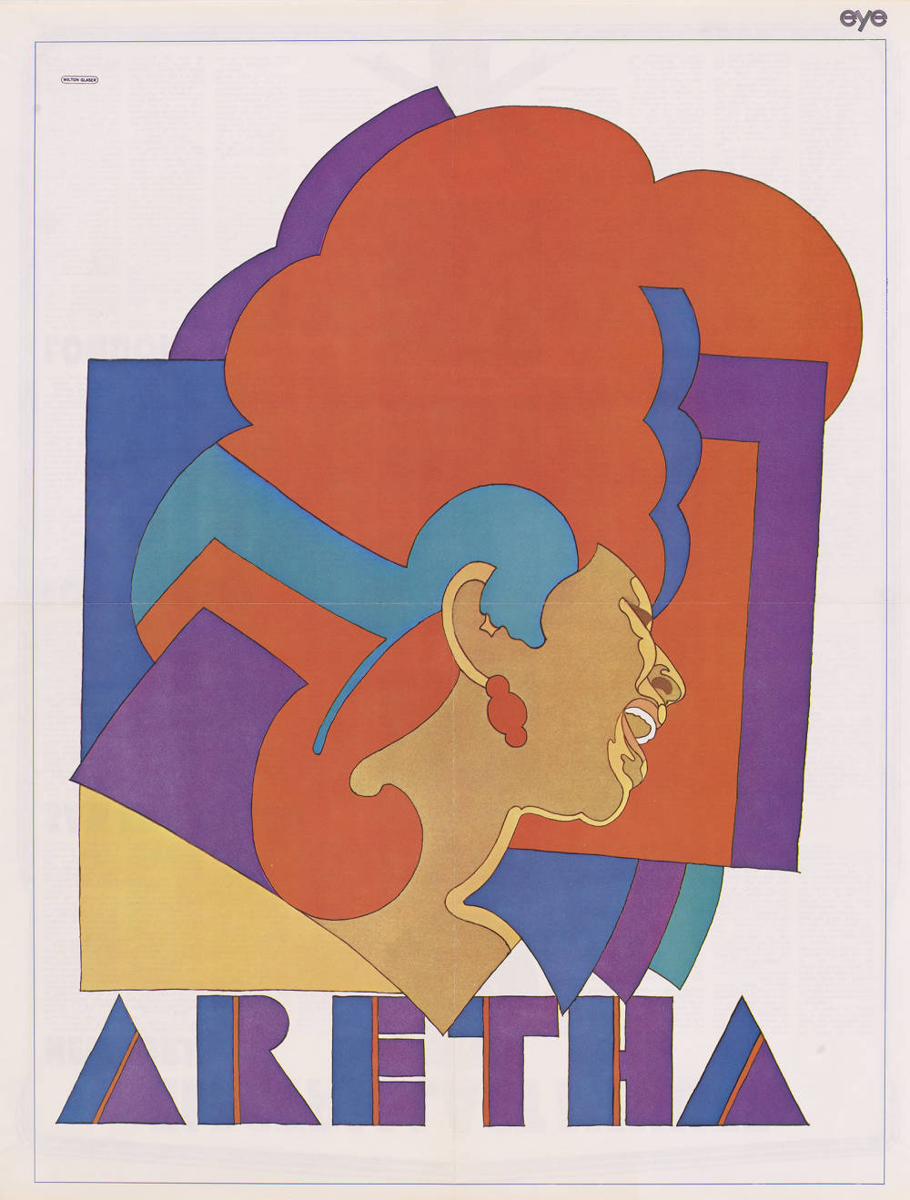
The appeal of Push Pin’s graphic design work was in its witty and eclectic viewpoint compared to most graphic design firms at the time. Drawing from a wide array of sources including Italian Renaissance painting, comic books, Victorian typography, and woodcut illustrations, the studio gained a distinctive style characterized by exaggerated forms, humorous juxtapositions, and colorful illustrations. Decades before Postmodernism would encourage the reconsideration of past art, Chwast and Glaser had already figured out the key. Their style rejected neither commerciality nor art history, instead, combining them in a unique manner that truly hybridized past and present. One of the most noteworthy and lasting pieces, Glaser’s 1967 “Dylan Poster,” married a Persian miniature with a Marcel Duchamp self-portrait, utilizing colorful bulging lines to epitomize the 1960s.
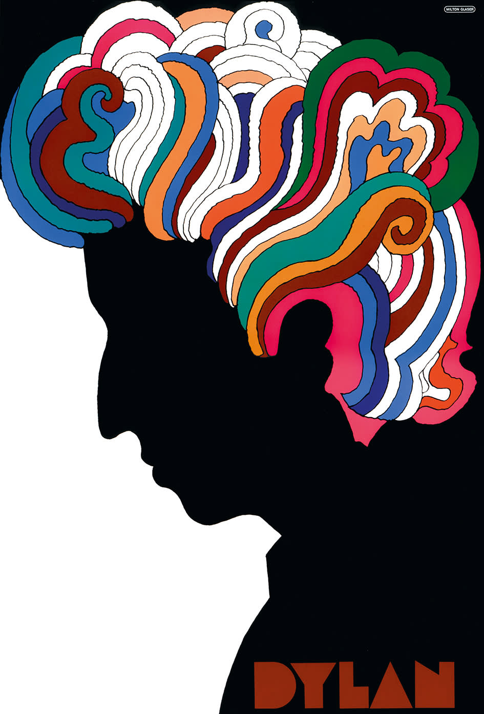
Milton Glaser
Bob Dylan Poster, 1967
When photography emerged as the dominating medium for commercial art, Push Pin clung to “old” artistic formats such as painting and collage, allowing them to intersect art with typography in such a way that would live on in graphic design for decades into the future. Push Pin’s original lettering became a significant part of their work, including Glaser’s “Babyteeth” typeface used on the Dylan poster. Furtherfore, many of the typography designed by Chwast and Glaser would become recognizable staples of the 1960s. Though typography may seem inconsequential, when one thinks of, say, an antiwar poster from the 1960s, chances are one of Push Pin’s fonts comes to mind.
Milton Glaser
Baby Teeth, Typeface Design, 1966
Milton Glaser
Baby Teeth, Typeface, 1966
Milton Glaser
Baby Teeth, Typeface, 1966
Milton Glaser
Mahalia Jackson Poster, 1967
Milton Glaser
The Baroque Inevitable, Album Cover, 1970s
Milton Glaser
The Sound of Harlem, Album Cover, 1970s
The unique styles created by Push Pin studios defined the 1960s. By drawing from the past, Push Pin changed aesthetic attitudes toward illustration and graphic design. The distinct motifs that the studio created would go on to have significant impact on the style of the decade and, given the materials they produced —record covers, book jackets, protest posters —changed the decade itself.