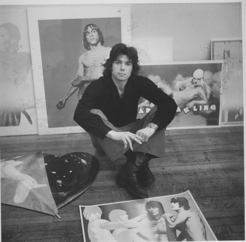
Portrait of Richard Bernstein
Published by Rizzoli in Richard Bernstein: STARMAKER
Born in New York City in 1939, American artist Richard Bernstein grew up with passion and a creative language that came to define the visual identity of the latter decades. After moving to the Chelsea Hotel in the early 1960s, the landmarked building where he lived until his death in 2002, Bernstein got acquainted with New York’s downtown art scene. But it wasn’t until a fortuitous meeting with Andy Warhol, the king of Pop, when his career truly took off.
Warhol became an admirer of Bernstein’s work and propelled him into stardom, much like he did with fellow superstars of the time. The duo not only found common ground through their interchangeable artistic styles – both were known for hyper-colored graphics and dazzling portraits – but they shared similar social habits and a likeminded fascination with celebrity. Consider it no coincidence that Warhol, the arbiter of Pop art, was one of Bernstein’s biggest fans and earliest supporters, once declaring him, “The man who made everyone look famous”.
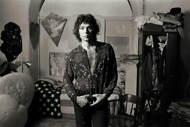
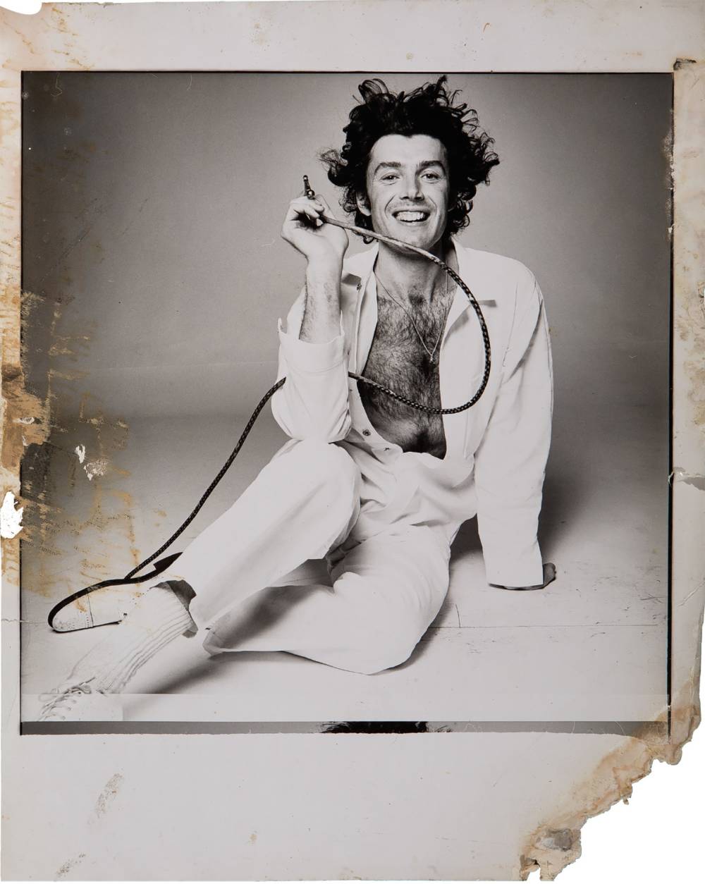
Norman Seeff
Portrait of Richard Bernstein at The Chelsea Hotel in New York, 1969
Upon being inducted into Warhol’s milieu and a fixture within fashion and Studio 54 culture, as well as the Max's Kansas City scene, the New York-based artist’s career exploded. By 1972, Warhol hired Bernstein as the exclusive hand to create the cover art for Interview Magazine, a position he held until the late 1980s.
Richard Bernstein
Back Room at Max's Kansas City, 1973
Richard Bernstein and Andy Warhol
1980
For nearly two decades Bernstein’s bold graphic portraits were the first visuals anyone saw in regards to the magazine, which was aptly nicknamed “The Crystal Ball of Pop” in the 1970s. Soon, Bernstein’s lipstick-scrawl banners were the face of Interview, all while becoming as recognizable visuals within popular culture of the time as Warhol’s own work.
Richard Bernstein
Interview Magazine starring Isabella Rossellini, 1978
Richard Bernstein
Interview Magazine starring Deborah Harry, June 1979
Richard Bernstein
Interview Magazine starring Diana Vreeland, December 1980
Richard Bernstein
Interview Magazine starring Stevie Wonder, June 1986
Bernstein’s bold covers helped define the visual identity of the disco era in all of its glory. His shading, collage and airbrush methods turned already iconic subjects into dazzling graphics exuding an air of otherworldly-ness. He injected fantasy and sexuality into otherwise basic photographs; transforming celebrity portraits, often taken by the likes of Herb Ritts and Albert Weston, into hyper-colored, pop icons.
Richard Bernstein
Interview Magazine starring Aretha Franklin, December 1986
Richard Bernstein
Interview Magazine starring Mick Jagger, February 1985
Richard Bernstein
Interview Magazine starring Elizabeth Taylor, November 1976
Richard Bernstein
Interview Magazine starring Madonna, December 1985
Over the years, every star from Aretha Franklin, Marilyn Monroe and Mick Jagger, to Jackie Kennedy, Keith Haring, Elizabeth Taylor and Madonna graced the covers of Interview Magazine, transformed into larger-than-life incarnations of themselves through Bernstein’s magic touch. Much like Warhol, he celebrated beauty and glamour, enhancing each of his hundreds of subjects into pop gods with an airbrushed aura.
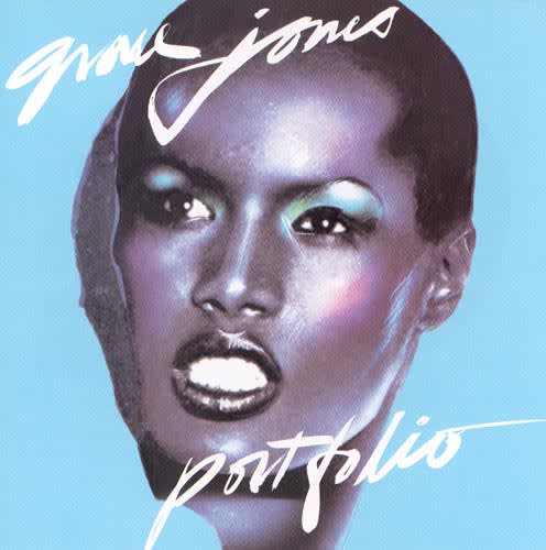
Grace Jones
Portfolio Album Cover, Richard Bernstein, 1977
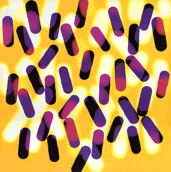
New Order
Fine Time Album Cover, Peter Saville & Trevor Key, based on a painting by Richard Bernstein, 1986
While Bernstein’s Interview covers are the work for which he is best known, he also explored the worlds of fine art and music – designing countless album covers for the era’s greatest musicians – and worked on a slew of editorial projects for international publications. By the latter 1980s his visual language was grandfathered into the history of graphic design and popular culture. So much so that in 1990 the World Federation of the United Nations Association commissioned Bernstein to create the first UN Postage stamp of the new decade, placing him in the ranks of Warhol, Alexander Calder and Pablo Picasso, who had all been similarly honored. Bernstein's grapic, aptly titled "True Colors," featured a vibrant collage of images depicting young childen from around the world.
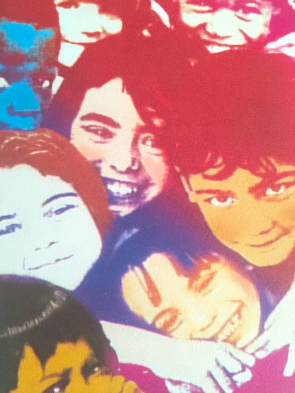
Richard Bernstein
True Colors, 1990
While no artist comes close to rivaling Andy Warhol’s level of impact on the history of art and culture in the past century, Richard Bernstein’s visual wit and transformative style enhanced Warhol’s celebrity, and forever changed the future of publishing and graphic design.