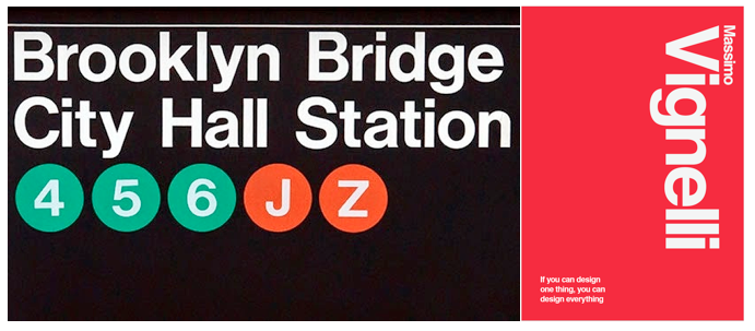
Massimo Vignelli
Design
Massimo Vignelli and Bob Noorda
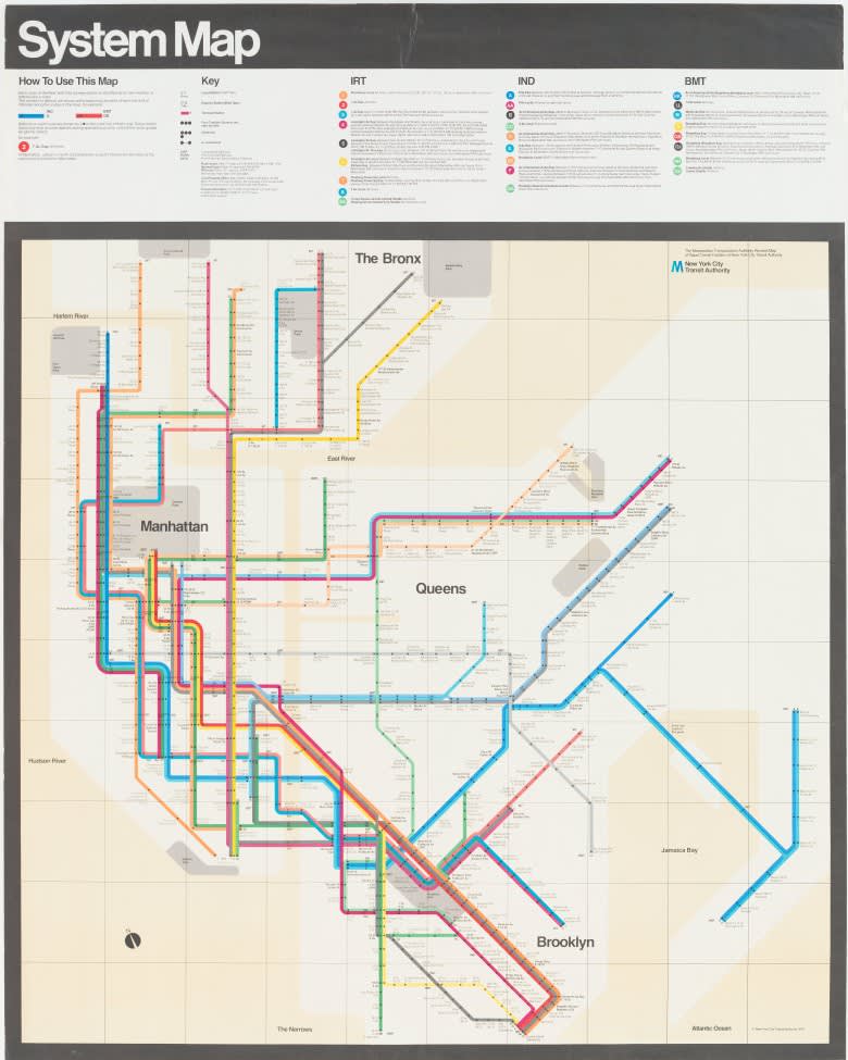
Subway Map
What was transit like in New York City before the Uber’s, Waze’s, Google Maps and Lyft’s of the world existed? Decades ago, prior to cunning app developers employing technology as a means of optimizing travel, the powers that be at the New York Transit Authority sought solace in a little known graphic designer named Massimo Vignelli.
Up until the mid-1960s, navigating the nightmarish NYC Subway was akin to wandering through a never-ending, chaotic land maze, blindfolded and unable to ask for assistance. Desperate for an answer to the underground system’s mismatched signage, overlapping, illogical styles of communication, and an overall flawed user experience, the New York Transit Authority tapped designer Massimo Vignelli and his business partner, Bob Noorda, to spearhead a complete visual overhaul.
Massimo Vignelli and Bob Noorda
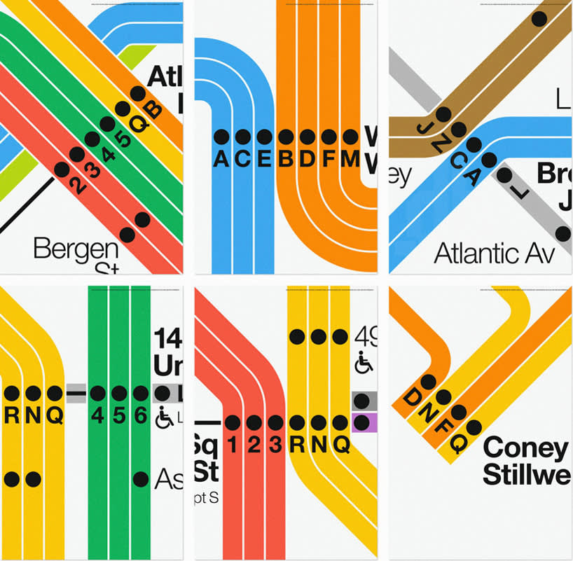
Subway Map Close-up
After building a substantial resume of design work across Europe, Vingelli and Noorda moved to New York City in 1965 and established a consulting agency named Unimark International, with the hope of imbuing their modernist design language on the growing needs of corporate America. The duo’s first commission as newcomers on the east coast ended up to be the defining project of their careers.
Massimo Vignelli
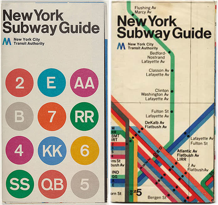
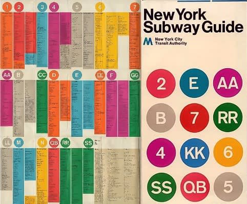
New York Subway Guide
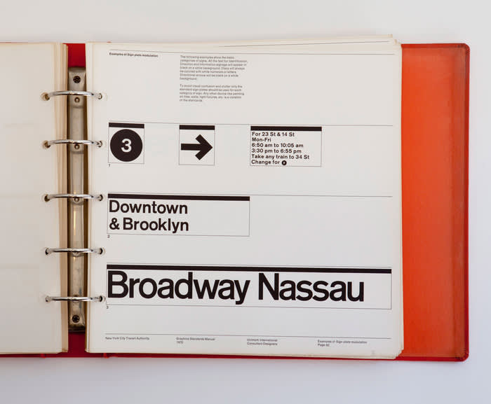
Unimark was hired by the New York Transit Authority with the heavy task of modernizing and unifying the subway’s signage and wayfinding system. The designers not only needed to understand WHAT millions of people were looking for and WHERE they would look, but ultimately HOW they could provide the least amount of information necessary in the most direct manner possible. Rather than approaching the commission as graphic designers, Vingelli and Noorda took on the role as problem solvers, applying design strategy to serve both a visual and functional purpose.
Massimo Vignelli and Bob Noorda
New York City Subway Street-Level Sign. 1966–70. Porcelain-enameled steel
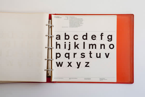
Through an extensive amount of behavioral research, the duo discarded the decades-old, crowded and illegible maps, in favor of streamlining the system’s typography using Helvetica, the world’s preferred sans serif typeface, while assigning particular distinction to colors and shapes over an abundance of unnecessary text.
Massimo Vignelli and Bob Noorda
New York Subway Guide
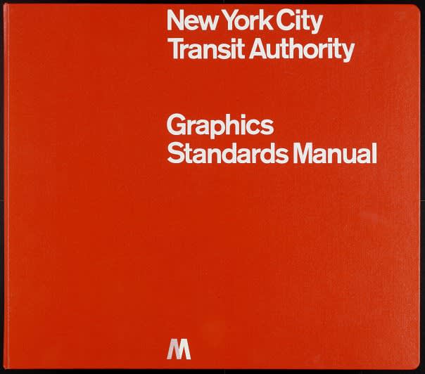
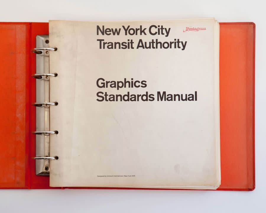
The culmination of this extensive and enduring project was a hefty, 182-page book entitled, ‘The New York City Transit Authority Graphics Standard Manual’, which first appeared in 1970. This de facto rulebook, outlining everything design-related for the entire subway system, solidified the importance of ‘information design’ as a means of improving efficiency and navigability.
Massimo Vignelli and Bob Noorda
The New York City Transit Authority Graphics Standard Manual
Massimo Vignelli and Bob Noorda
The New York City Transit Authority Graphics Standard Manual
Massimo Vignelli and Bob Noorda
The New York City Transit Authority Graphics Standard Manual
Massimo Vignelli and Bob Noorda
The New York City Transit Authority Graphics Standard Manual
While some initially viewed Vignelli’s design as too abstract, Unimark’s modernist map stylistically impacted an entire era of graphic design, which put strong emphasis bright colors and geometric shapes. While Vignelli and Noorda went on to create remarkable careers for themselves through countless notable commissions, their original Subway Map diagram is still, to this day, held as a paragon of successful design.