Frank Lloyd Wright
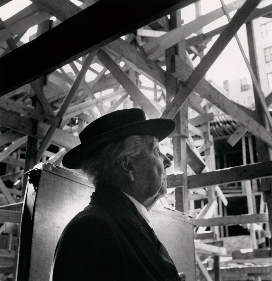
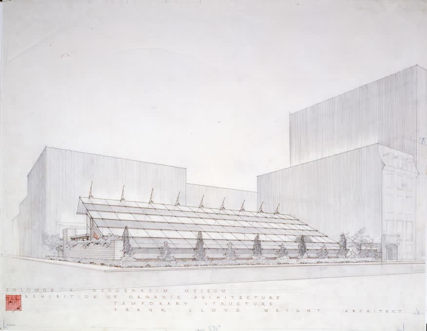
Solomon R. Guggenheim Museum during construction, New York, 1957
Architects, by trade, are draftsmen, designers, and builders – builders of structures, and in many cases, builders of dreams. While individuals working in the field of architecture are often known and remembered by the building they design, few foster personal brands outside the identities that exist through their respective structures. As with anything, there are exceptions to this philosophy, perhaps none more significant than American architect Frank Lloyd Wright.
Throughout his seemingly endless career, Frank Lloyd Wright designed more than 1,000 structures, nearly 550 of which were completed during his lifetime. While Wright is widely recognized as one of the greatest architects to ever live, his unwavering knack for branding was an equally potent, albeit less glorified aspect of his seven-decade career.
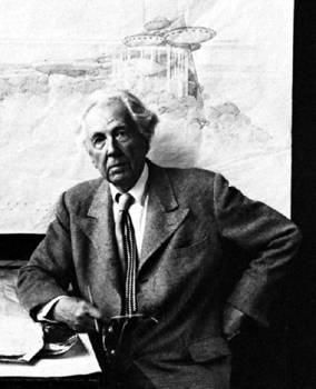
Portrait of Frank Lloyd Wright
Frank Lloyd Wright
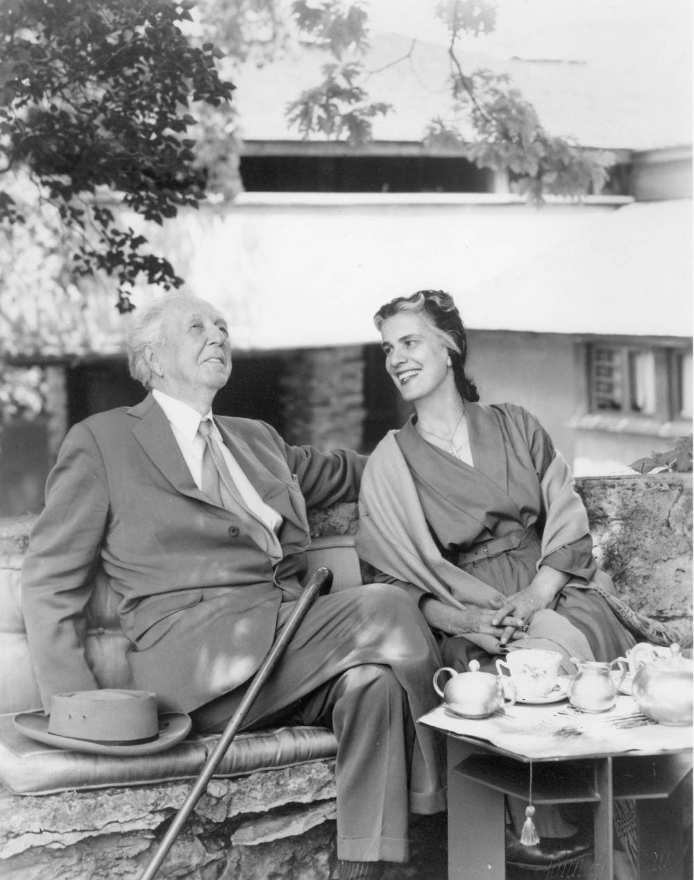
With his wife, Olgivanna Lloyd Wright
In many respects, Wright’s 500+ buildings immortalize the architect and his all-encompassing personal brand, so much as the idiosyncratic customization of his clothing and cars, as well as his big hair; all of which worked together to amplify an otherwise physically small man into a metaphorical giant. Much like Wright, Le Corbusier employed his trademark round-rimmed spectacles to build a personal image outside of his work. Unlike his contemporaries, however, Wright developed literal and figurative means of branding himself and his buildings, well before the post-WWII public relations and branding boom that took place across the United States.
Frank Lloyd Wright
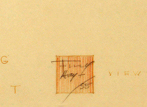
Early Branding Sketch of Red Square
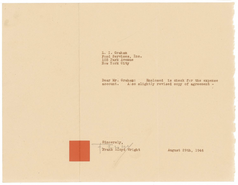
Frank Lloyd Wright
Custom Red Square Stationary, 1946
The brand as a graphic or visual artifact rose to prominence through the work of Mid-20th century art directors such as Paul Rand and Saul Bass, whose ubiquitous logotypes for corporate entities such as Ford and IBM changed graphic design for generations to come. Decades before entire industries were established as a byproduct of the branding boom, Frank Lloyd Wright began employing artful means of self-presentation across all aspects of his personal and professional life, most often through a simple red square and the architect’s trademark insignia.
Paul Rand
IBM Logo

Paul Rand
Eye-Bee-M

Frank Lloyd Wright
Earliest Red Square Logo Iteration
Frank Lloyd Wright
Taliesin, Red Square Logo
From the cross-in-circle-in-square logo that Wright first adopted in the beginning years of his independent practice, to his branded architectural drawing sets, and the iconic red square “name plate” tiles that reside on a number of his most revered buildings, Frank Lloyd Wright branded his structures and himself much like artists sign their paintings, and like Nike employs their trademark swoosh across every product they release into the market.
Frank Lloyd Wright
Cross in Circle in Square Logo
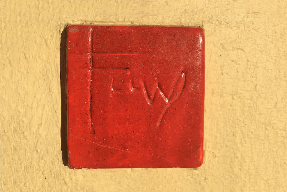
Frank Lloyd Wright
Red Square Tile
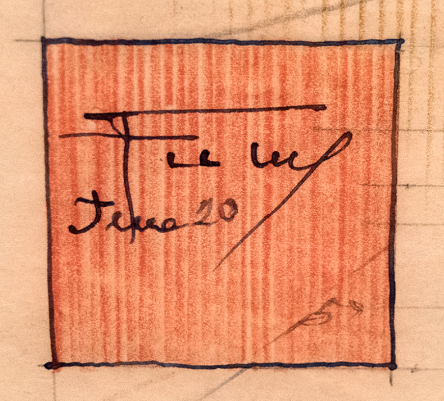
Frank Lloyd Wright
Sketch of Red Square Tile
While the origins of Wright’s simplistic red square dates back as early as 1896, the motif was consistently applied to drawings beginning in 1904 and became the architect’s signature logo nearly a decade later. Inspired by the blocky signature seals impressed through crimson ink or wax often found in traditional Japanese printmaking, Wright’s brownish red squares aided the architect’s artful means of personal branding, while symbolically mediating the given work’s subject and object.
Frank Lloyd Wright
Sketch, with Signature Red Square
Frank Lloyd Wright
Sketch, with Signature Red Square
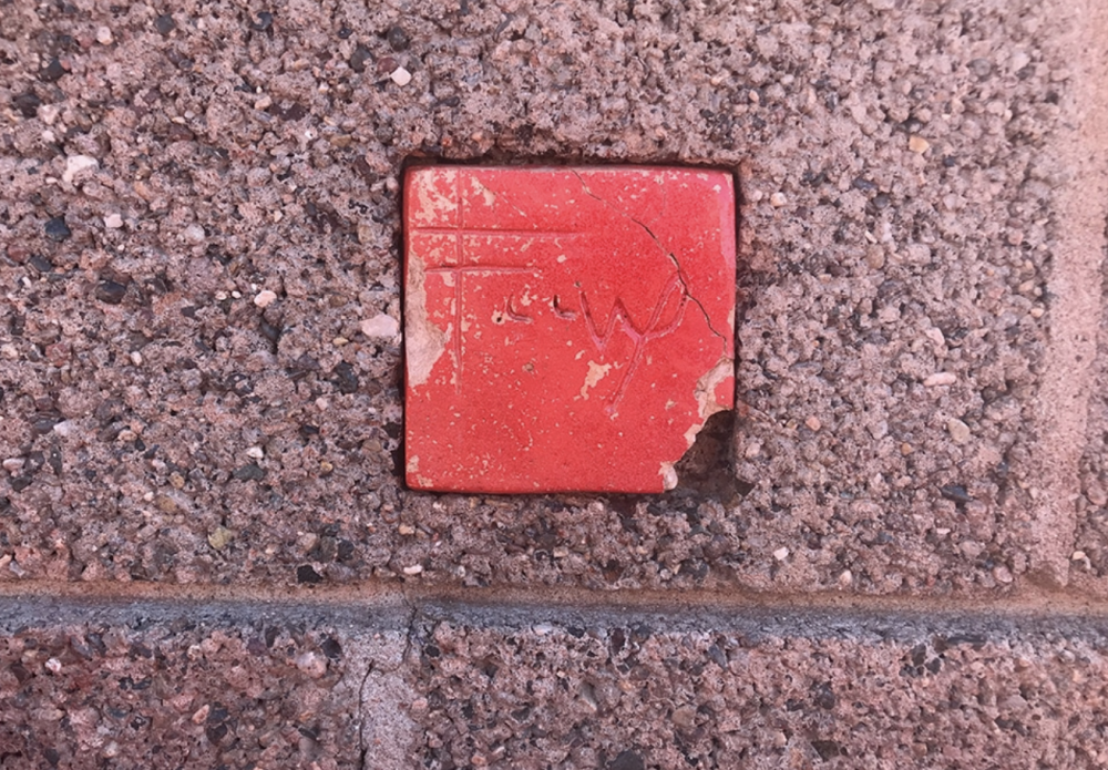
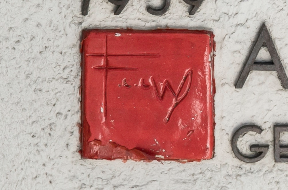
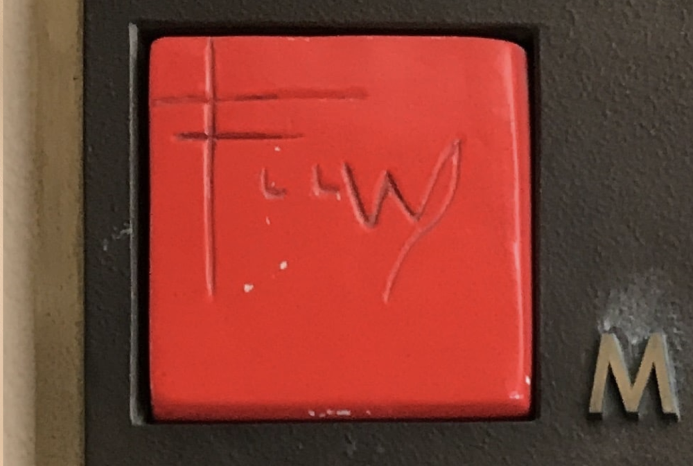
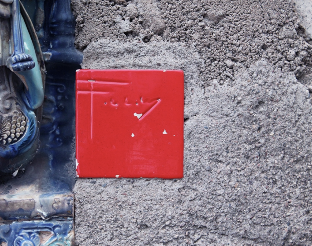
Soon after Wright adopted this trademark motif across printed material ranging from personal stationary to architectural drawing sets, he started applying signed, red square tiles to the façades of his completed buildings, acting as subtle alternatives to flashy nameplates and grand commemorative plaques. In 1950 the architect commissioned ceramicist Jeanette Pauson Haber to make 25 tiles inscribed with his initials, which Wright intended to place on forthcoming structures. Much like in the tradition of Japanese printmaking, Wright’s red tiles served as both a signature block and, when finally secured to a completed building, represented the architect’s seal of personal approval.
Frank Lloyd Wright
Tile, Harold Price Sr. House
Frank Lloyd Wright
Tile, Solomon R. Guggenheim Museum
Frank Lloyd Wright
Tile, Marin County Civic Center
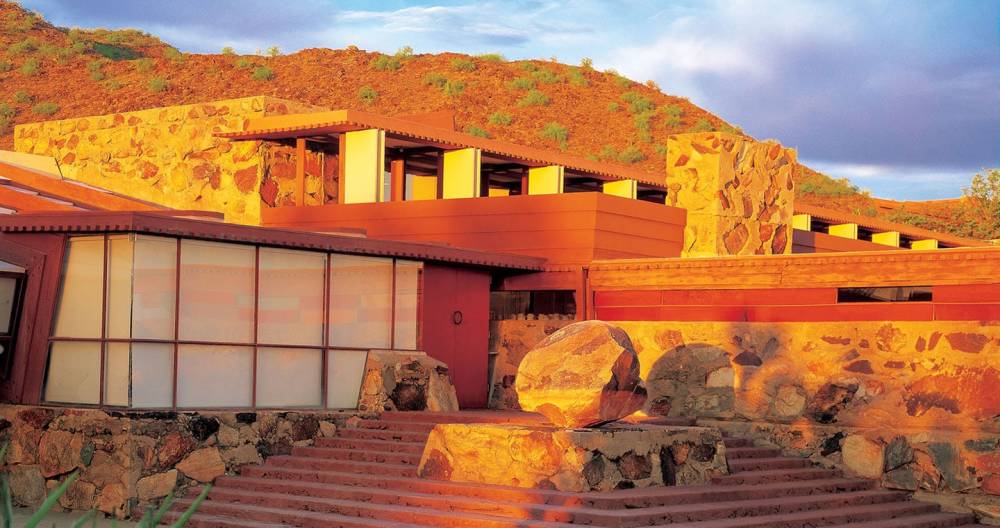
Frank Lloyd Wright
Tile, Taliesin West
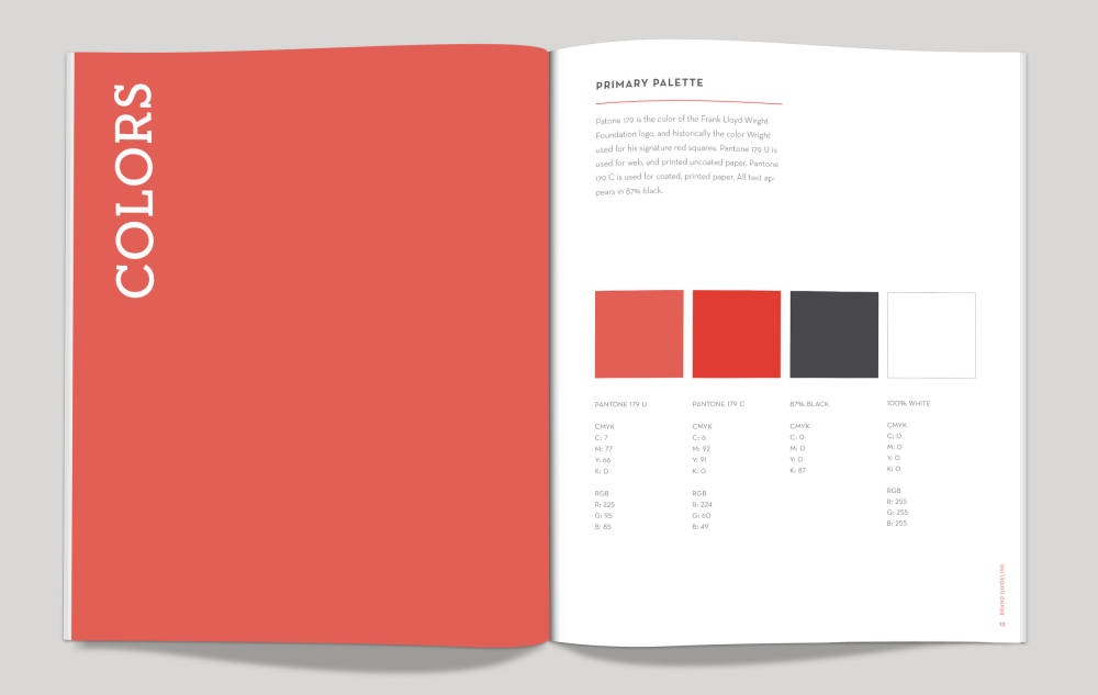
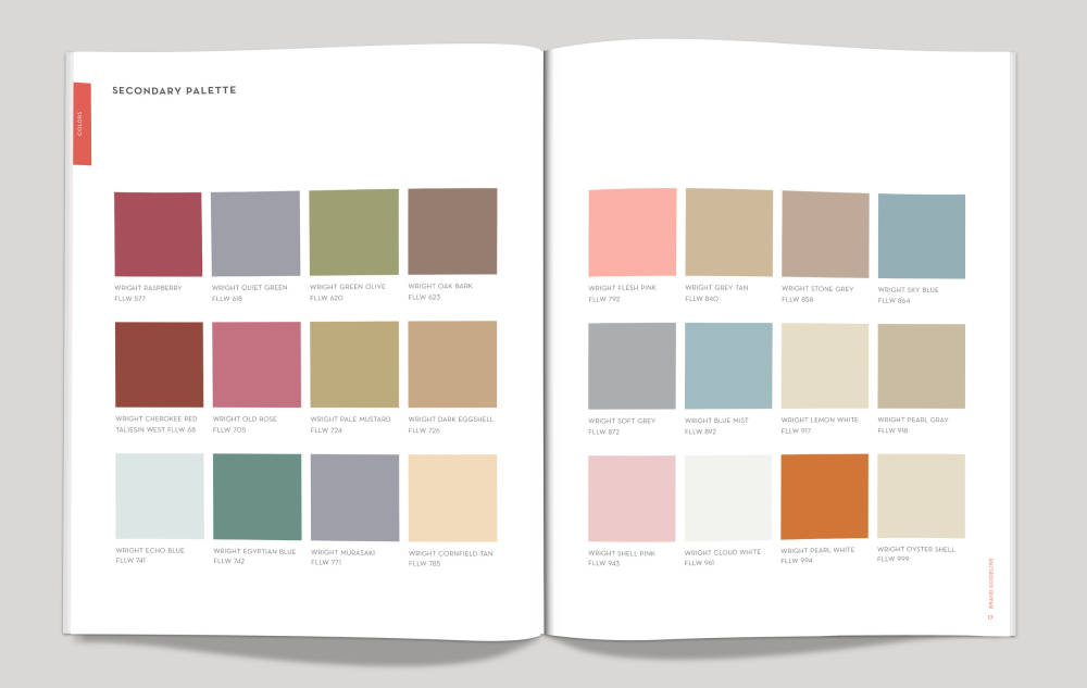
Frank Lloyd Wright solidified his visual language through color and form so much as he did through his design sensibilities. In fact, the red hues that Wright most often used were not just any red. Much like artist Yves Klein’s eponymous “International Klein Blue,” Frank Lloyd Wright developed a specific primary Pantone color palette composed of a slightly lighter and slightly darker red, as well as dark grey, and white, in addition to a secondary Pantone palette, which often served as accents. Wright rarely diverted from these pre-selected colors unless at the special request of a client, a conscious decision that kept the branding and visual identity extremely tight and consistent throughout his array of different projects.
Frank Lloyd Wright
Main Color Palette
Frank Lloyd Wright
Secondary Color Palette
Today, the power of Frank Lloyd Wright’s personal brand is omnipresent. From the miniature red tiles that reside on some of his most iconic structures, ranging from Taliesin West in Scottsdale, Arizona to the Guggenheim Museum in New York City, and the numerous projects, such as Fallingwater, that will forever remain icons within the lexicon of American design. Frank Lloyd Wright’s genius spans worlds well outside of architecture, while his overwhelming influence in design and branding is only becoming enduringly resistant as time goes on.