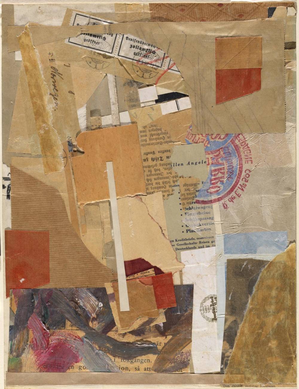
Kurt Schwitters
Opened by Customs, 1937-38
In the midst of a global pandemic, the act of going to see art in a museum is no longer possible, and while online exhibitions are a wonderful resource, they lack the physicality of experiencing a work of art directly in front of you. For that matter, there has always been a tangible difference between looking at art and being able to hold it, to feel its texture, and to interact with it.
For reasons both obvious and hidden, the commercial art world has always been closed off to the kind of personal connection one experiences through touch. Both as a form of protection and ‘gatekeeping,’ a majority of art is hidden behind barriers, museum guards, entry fees, and “do not touch” signs. It is fitting, then, that this week Minnie Muse is discussing a decidedly different kind of art – one that is more personal and able to be held – art that comes in the mail.
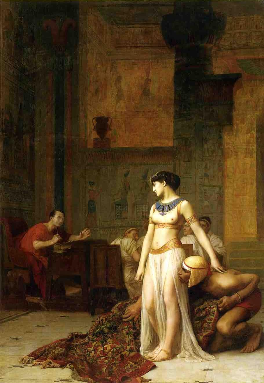
Jean-Leon-Gerome
Cleopatra and Caesar, 1866
In 48 BC, the Egyptian queen Cleopatra effectively created the first piece of mail art: herself. Rolling her body in a carpet to be smuggled to Julius Caesar, Cleopatra’s political play would lead to a global movement several centuries later. In the 1960s, Mail Art, or ‘Post Art’ as it was sometimes dubbed, emerged as a form of shared communication that rejected the institutional structures of the commercial art world. Letters exchanged between artists, friends, and strangers were seen, felt, added to, and passed along, creating a global project unlike anything the art world had previously seen. Unlike most of the art industry, Mail Art had no rules or criteria, emphasizing collaboration and breaking down barriers of ideology.
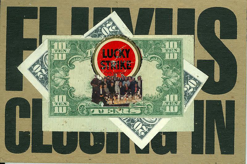
Ray Johnson
Mail Art
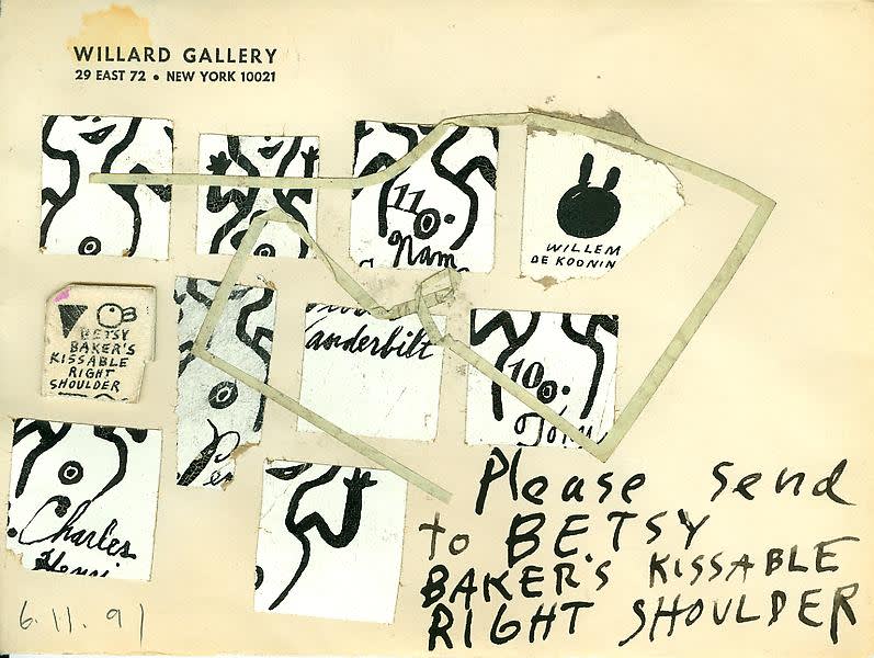
Ray Johnson
Mail Art, 1991
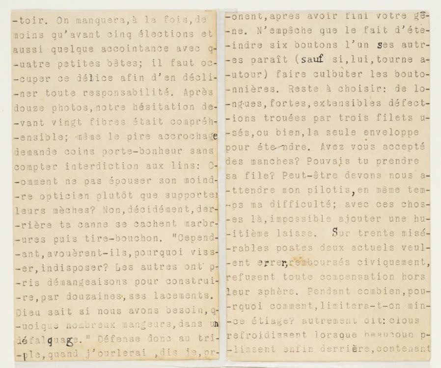
Marcel Duchamp
Rendevous of Sunday, February 6, 1916
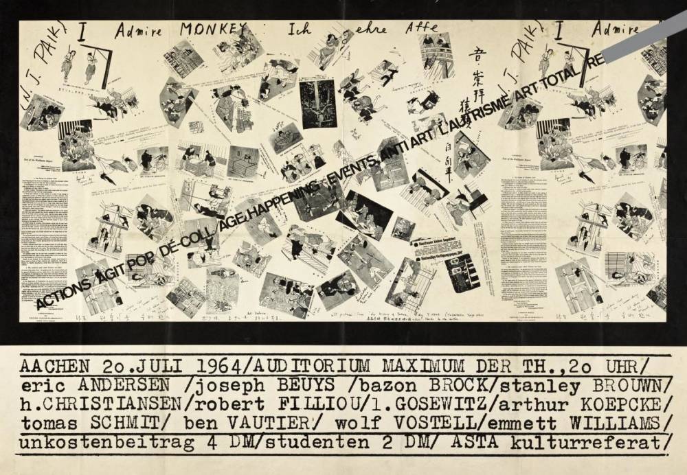
Joseph Beuys
ACTIONS : AGIT POP : DÉ-COLL : AGE : HAPPENINGS : EVENTS : ANTI ART : L’AUTRISME : ART TOTAL : RE, 1964
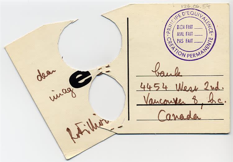
Robert Filliou
Karte, 1954
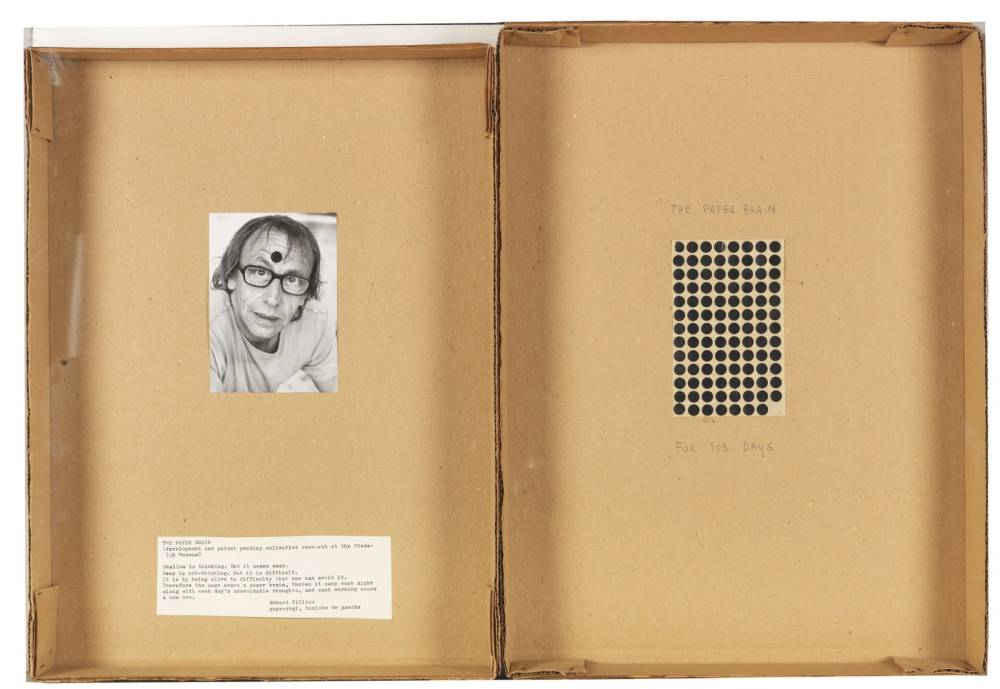
Robert FillIou
The Paper Brain for 103 days, 1972
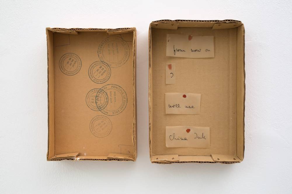
Robert Filliou
From Now On I Will Use China Ink, 1973
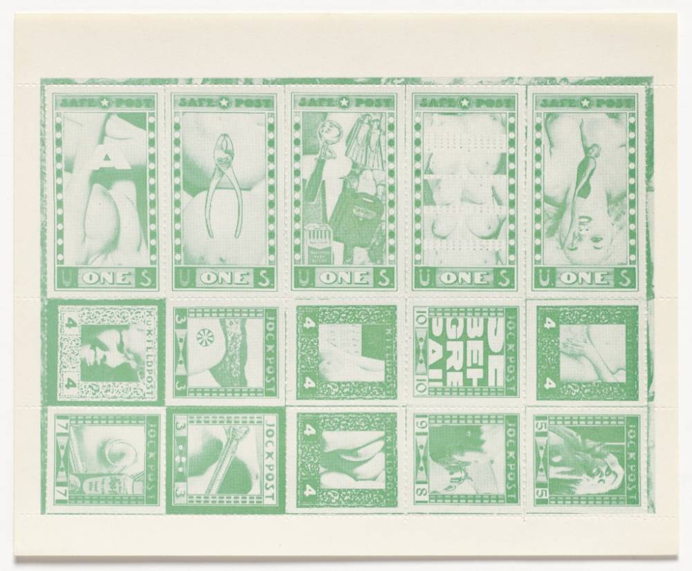
Robert Watts
Safe Post : K.u.K. Feldpost : Jockpost, 1962
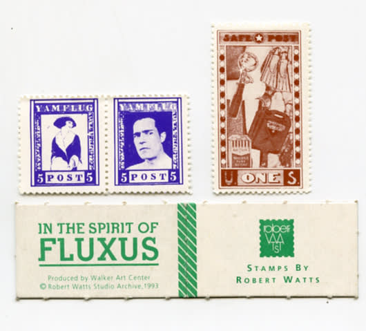
Walker Arts Center
In Memory of Robert Watts, A Set of Stamps, 1993
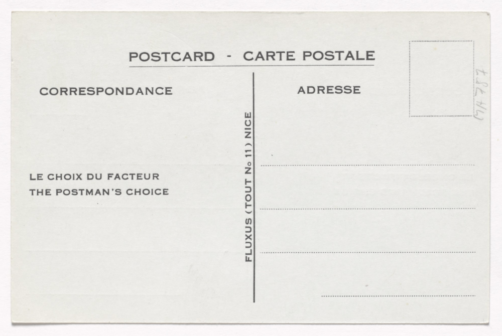
Ben Vautier
The Postman's Choice, 1965
Kicking off this phenomenon, artist Ray Johnson began experimenting with mail in 1943 with embellished envelopes, which grew into art made by shipping collages, drawings, and found objects, sometimes directing the receivers to “add to and return”. Meanwhile, the Nouveau Réalisme group emerged as a counter to American Pop art, utilizing conceptual collage and assemblage. The group’s fascination with everyday materials morphed into a usage of letters and rubber stamps. Johnson, along with a group of avant-garde international artists called Fluxus, recognized the significance of mail in their playful spirit and mission to destabilize the art industry and reintroduce the public to this hidden world. Fluxus members Robert Filliou, Robert Watts, and Ben Vautier used postage items such as envelopes, paper, and stamps in their works.
Ray Johnson
Mail Art, Collage using Artforum Magazine Cover
Ray Johnson
Ice Cream Sandwiches, 1944
Ray Johnson
Mail Art, 1954
Ray Johnson
Mail Art
Ray Johnson
Mail Art to Lucy Lippard, 1969
Ray Johnson
Mail Art
Ray Johnson
Mail Art to Dr. Frye and Lucy Lippard, 1970
Ray Johnson
Mail Art, 1971
Ray Johnson
Baldessari Heart, 1973
Ray Johnson
Untitled (Cupid with Ad Reinhardt), 1974
Ray Johnson
Mail Art
In 1962, one of Ray Johnson’s collaborators, Ed Plunkett, dubbed this international network of art “The New York Correspondence School,” which Johnson sometimes intentionally misspelled as “Correspondance” to emphasize the undisciplined and free-spirited nature of the project. A major part of Johnson’s work with the “school” included disrupting traditional art through re-education. Johnson would often mail annotated flyers describing “how to draw” or histories of various art styles, with whimsical sketches and notes allowing the individual to interpret Johnson’s non-linear lessons and narratives. The flexibility and low-priced nature of mail art made it widely accessible to marginalized communities, and the movement soon spread throughout every continent, though the majority of it remained undocumented within the larger art world. Still, a few exhibitions on the subject took place, most notably the Whitney Museum’s 1970 show which was organized by Johnson himself along with art historian Marcia Tucker. Though the Correspondence School closed in 1973, the act of turning mail into works of art continued, with Ruud Janssen’s 1990s mail-interviews being considered one of the last great contributions to the movement. Still, the themes of collaboration, accessibility, and freedom that mail art came to exemplify live on in today’s internet age.
Ray Johnson
Invitation to the first mail art show of the New York Correspondence School at the Whitney Museum, 1970
Ruud Janssen
Mail Art Interview
Carol Stetser and Ruud Janssen
Mail Art Interviews
Anna Banana
Mail Art Interview
New New York Correspondence School
Mail Art, 2008
New New York Correspondence School
Mail Art, 2008
A key factor of the postal service is the stamp, and participants in mail art utilized this aspect of the process as another creative opportunity. “Artistamps,” or “faux postage” became their own sub-network, with artists designing their own stamps which functioned as their signature; exchanging them and collecting the stamps of other artists. Those more at the forefront of the commercial art world were even commissioned to design official international stamps. A dense list of artists have participated in stamp design, from traditionally recognized masters like Degas, Picasso, and Van Gogh, to surrealists like Salvador Dali and Frida Kahlo, all the way to pop artists like Andy Warhol and Keith Haring and contemporary avant-garde artists like Basquiat and Duchamp. Most recently, The U.S. Postal Service will honor pioneering Japanese American artist Ruth Asawa, with a stamp-set in collaboration with her estate that will be released in August 2020.
Vincent van Gogh
Artist Stamp
Vincent van Gogh
Artist Stamp
Pablo Picasso
Artist Stamp
Edgar Degas
Artist Stamp
Edgar Degas
Artist Stamp
Salvador Dali
Artist Stamp
Salvador Dali
Artist Stamp
Frida Kahlo
Artist Stamp
Frida Kahlo
Artist Stamp
Andy Warhol
Red Airmail Stamps, 1962
Andy Warhol
Artist Stamp
Keith Haring
Artist Stamp
Keith Haring
Artist Stamps
Jean-Michel Basquiat
Artist Stamp
Marcel Duchamp
Artist Stamp
Ruth Asawa
Artist Stamp
Ruth Asawa
Artist Stamp
Always fascinated by movement and conceptual ideas, the Turkish-born fashion designer Hussein Chalayan borrowed from the concepts of mail art for his “Cartesia” collection, originally conceived at Central Saint Martins. Officially emerging as a collection in 1994, Chalayan’s Airmail Dress put art and fashion in conversation with one another. The garment, which was designed to be folded small enough to fit in an envelope and sent overseas, was highly customizable much like the art sent by Ray Johnson. The piece invited owners to write on it, allowing the wearer to connect with people far away on a tangible level, literally wearing the messages of their family, friends, or lover on their sleeve. Chalayan’s Airmail Blazer, famously worn by Bjork on the cover of her Post album, similarly examined the idea of mail with red and blue striped hems recalling international envelopes. For their Spring/Summer 2016 collection, Vetements debuted an ironic branding of mail art, utilizing the express mailing service DHL’s logo on T-shirts, beginning a trend of direct appropriation not previously seen in the fashion world.
Hussein Chalayan
Air Mail Dress, 1999
Hussein Chalayan
Air Mail Dress, 1999
Hussein Chalayan
Air Mail Dress, Pattern Notes on Dress, 1999
Hussein Chalayan
Air Mail Jacket, 1995
Hussein Chalayan
Air Mail Jacket, 1995
Bjork in Hussein Chalayan
Air Mail Jacket, 1995
Vetements
Spring/Summer 2016
Vetements
Spring/Summer 2016
The well-recognized piece of mail-related fashion, of course, comes directly from the United States Postal Service itself. The now-iconic mail carrier uniform has a long history of modifications. Like the military, the look and uniformity of mail carrier garb is a crucial piece in advertising the mission of the Postal Service to the public. The uniforms must be both dignified and utilitarian, while also being able to accommodate physical activity and unpredictable weather conditions. The first notable step in creating these uniforms came in small increments during the period from 1868 to 1901, wherein the Post Office Department—as it was then called—introduced specific seasonal outfits along with numbered badges and pith helmets. Throughout the first half of the 1900s, more changes were made such as the ability for carriers to take off their jackets on hot days, new badges, the introduction of windbreakers, and Red Wing oxfords. Furthermore, the inauguration of the Postal Service’s first batch of female employees in the 1950s necessitated more changes in trouser and jacket fits to accommodate these new members of the work force. As military wear improved with the introduction of synthetic fabrics, so too did that of postal uniforms, introducing weather-proof materials to accommodate any and all atmospheric conditions. Furthermore, from the 1970s to the ‘90s, uniforms became more relaxed, allowing shorts and baseball caps, and changing the classic blue-grey to a rich navy.
USPS
Mail Carrier, 1700s
USPS
Mail Carrier, 1800s
USPS
Mail Carriers, 1888
USPS
Mail Carrier, 1910s
Norman Rockwell
Red Wing Shoe Advertisement, USPS Mail Carriers, 1950s
USPS
Female Mail Carrier, 1960s
USPS
Lunching Mail Carrier, 1960s
USPS
Postal Worker on Strike, 1970s
USPS
Mail Carrier, 1980s
USPS
Mail Carrier, 1990s
USPS
Mail Carrier, 1990s
USPS
Mail Carriers, 2000s
Uniforms were not the only pieces of the Postal Service that underwent significant change over the past century. The design of the USPS logo evolved dramatically from the introduction of the service to today. Until 1837, the postal seal appropriately featured the Roman messenger god Mercury, until it was later changed to a horse and rider, created in the days of mail delivery by horse. The 1970 Postal Reorganization Act, which changed the name from Post Office Department to the United States Postal Service that we know today, also updated the antiquated seal design to the standing eagle, a patriotic representation of the nation that postal workers stood for. Finally, in 1993, the seal was once again re-branded for the modern era, becoming the sonic eagle that we know today.

USPS
First Logo, 1800s-1900s

USPS
Eagle Logo, 1980s

USPS
Eagle Logo, 1990s
USPS
Text Based Logo, 1990s

USPS
Eagle Logo, 2000s

USPS
Inspection Service Logo, 2000s
The final crucial piece of the mail system is the government buildings themselves. Many of the large, central post offices around the country are historical landmarks and utilize brilliant architecture from a variety of influences. The infamous City Hall Post Office in New York City, which was designed by architect Alfred Mullet and opened in 1880, was dubbed “Mullet’s monstrosity” due to its out-of-date French baroque architecture. Despite its ornamental features, the building was always considered an eyesore and was demolished before the 1939 World’s Fair. Brooklyn’s Federal Building and Post Office, whose construction was finished in 1892, resembles an elegant castle in the Romanesque Revival style. Featuring a two-floor atrium and intricate dormers and rounded arches, this Mifflin E. Bell design is typical for civic buildings, which seek to echo the communal problem-solving associated with the Romans.
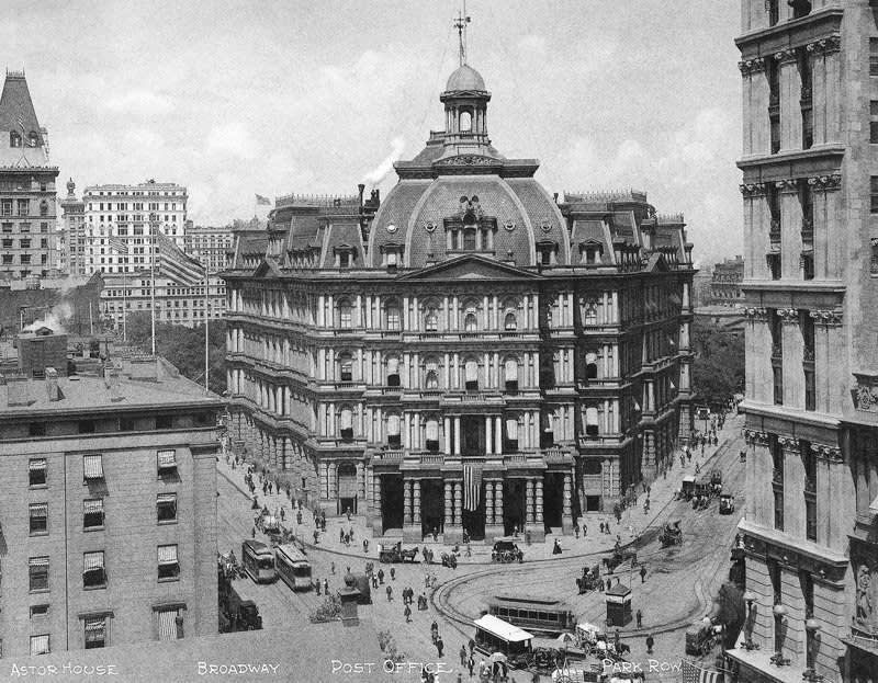
Alfred Mullet
City Hall Post Office, New York City, 1880
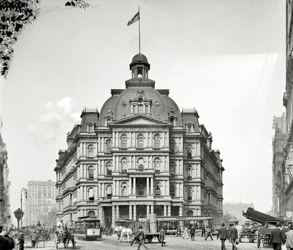
Alfred Mullet
City Hall Post Office, New York City, 1880
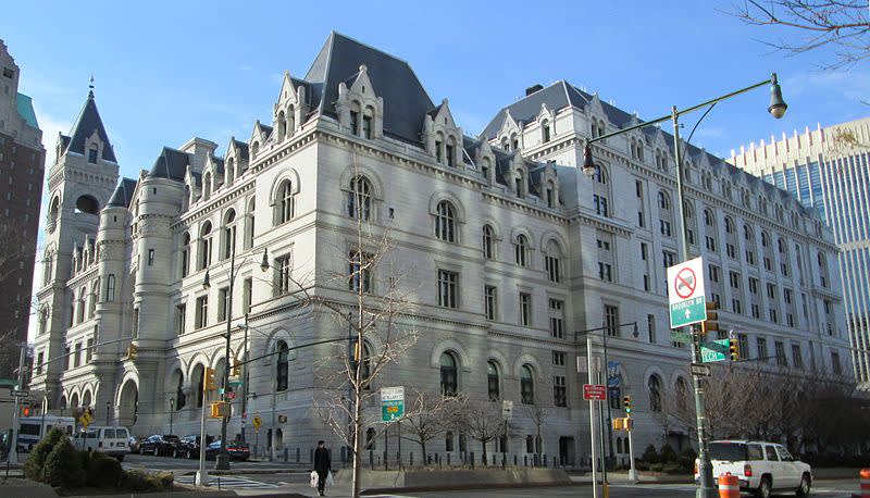
Federal Building and Post Office
Brooklyn, New York, 1882
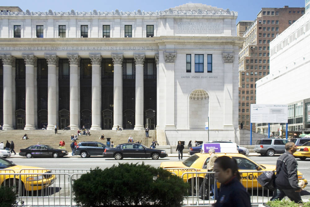
Similarly, the Grand Central Station post office designed in 1906, adjacent to Grand Central Terminal, utilizes massive Doric columns, while the Bronx General Post Office, which borrows from the Art Moderne style of the 1930s, turns attention to the interior. Part of FDR’s New Deal project, the interior of the building holds 13 murals painted by Ben Shahn and his wife Bernarda. Based on the Walt Whitman poem “I see America Working,” the murals highlight patriotism and the importance of labor to the development of the country, saluting postal workers for their important roles in American society. Similarly, the James A. Farley Building in Midtown Manhattan bears the USPS motto: “Neither snow nor rain nor heat nor gloom of night stays these couriers from the swift completion of their appointed rounds.” In their own ways, each of these buildings exemplifies and celebrates the important work of the United States Postal Service as a massive collaborative effort that connects family, friends, loved ones, and artists across the globe.
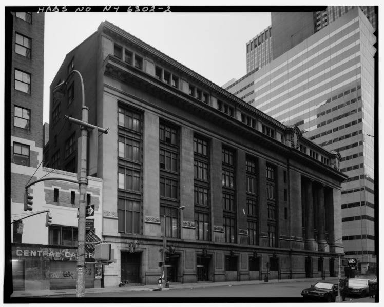
Grand Central Station Post Office
New York City, 1906
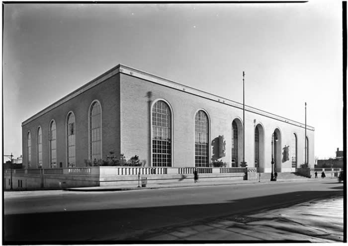
Bronx General Post Office
1930s
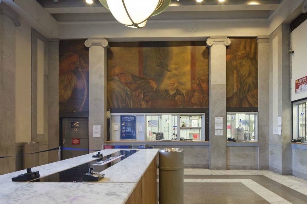
Bronx General Post Office
Interior Detail
