Tom Sachs
Nutsy’s McDonald’s, 2001
In Andy Warhol’s 1975 text “The Philosophy of Andy Warhol (From A to B and Back Again)” the American artist famously professed, “The most beautiful thing in Tokyo is McDonald's. The most beautiful thing in Stockholm is McDonald's. The most beautiful thing in Florence is McDonald's. Peking and Moscow don't have anything beautiful yet.” Leave it to the king of commonplace iconography to substantiate the cultural significance of the fast food industry’s most beloved brand.
Since its stateside founding in 1940, the diaspora of the McDonald's franchise has penetrated the globe. As far as American iconography is concerned, there is nothing more representative of post-war, Western culture than the burger giant’s fast-food cuisine, trademark primary colors and golden arches.
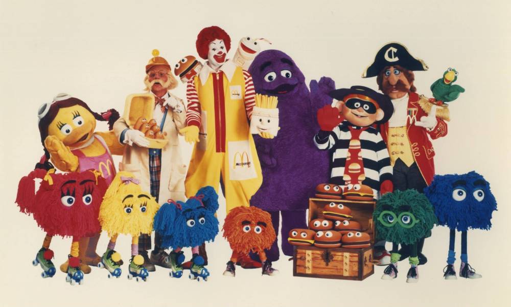
McDonald's
McDonaldland, 1986
It was American architect Stanley Clark Meston who first employed these iconic signifiers as architectural details in his 1953 design of the drive-in hamburger stand’s location in southern California. The resulting structure’s simple form and commercial function forever impacted the future of America’s roadside landscape; helping to establish the fast-food business as a branded industry from that point onwards.
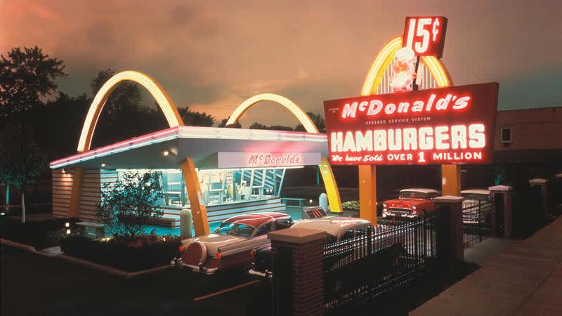
Stanley Clark Meston
McDonalds, California, 1950s
In the late 1960s, McDonald's abandoned Meston’s modernist, golden-arched buildings for standardized structures built off a recipe of architectural ingredients, akin to those of a typical franchise – mansard roof, brick exterior, and colonial style windows – opting, instead, for golden arch roadside signage. It wasn’t until the 1990s that renowned American architects Robert Venturi and Denise Scott Brown radicalized the design of a McDonald's location in Buena Vista, Florida. Fascinated by the role of communication in architecture, the duo designed a façade defined by signage and symbolism, employing the fast food brand’s iconic emblems as means of decoration to produce a cartoon-like, “Pop” structure, opting away from the reserved edifices that had become the chain’s architectural norm.
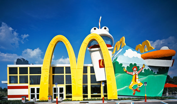
Robert Venturi and Denise Scott Brown
McDonald's, Buena Vista, Florida, 1990s
Prior to Venturi and Scott Brown’s architectural intervention of the franchise’s Buena Vista location, the brand’s move towards standardized, nondescript buildings was a decision symbolizing McDonald’s transition away from loud methods of visual branding. Instead, the brand’s growing awareness was on account of the fruitful creative partnership with American advertising agency, Leo Burnett. Since the early 1980s, Leo Burnett produced some of McDonald’s most iconic campaigns, contributing to the burger giant’s immense international success and growing global recognition.
McDonalds Advertising
1970s
McDonalds Advertising
1970s
McDonalds Advertising
1980s
McDonalds Advertising
2000
McDonalds Advertising
2000s
McDonalds Advertising
2000s
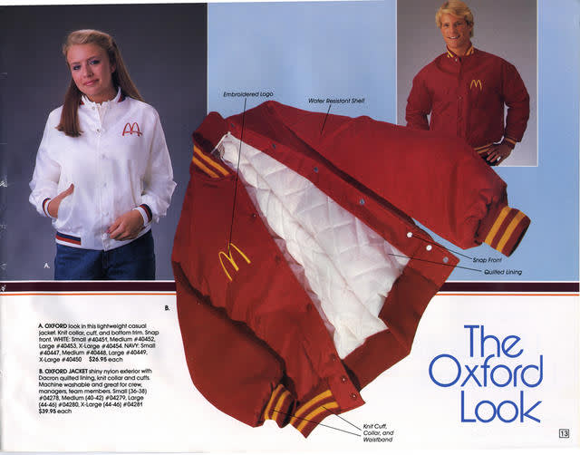
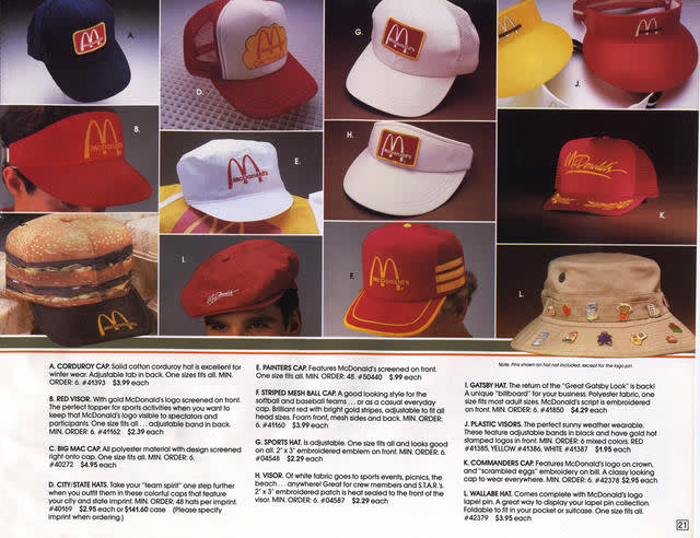
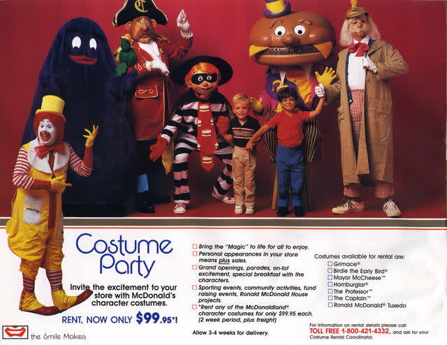
The company’s print and film advertisements throughout the decade were some of the brand’s most exemplary to date, garnering a feverish following of devoted customers. So much so, that in 1987 the fast food chain launched a sixty-four-page catalogue of merchandise for its loyal fan base to outfit themselves in McDonald’s-branded attire and accessories. “The Smile Makers ‘88”, was a prolific exercise in branding and ephemera, akin to that of The Apple Collection. When viewed through a contemporary lens, the employee fashion catalogue was a forerunner to modern day streetwear, employing a multitude of signifiers – overt branding, loud graphics, everyday objects and commonplace materials – which together, symbolized how the ordinary and banal can somehow be made iconic and extraordinary.


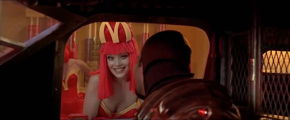
While “The Smile Makers Catalogue ‘88” was McDonald’s first foray into consumer-driven apparel, in the decades that followed, numerous fashion designers have appropriated the fast food giant’s trademark iconography. In 1997, French couturier Jean Paul Gaultier created bright red and yellow employee uniforms with ornamental insignias outlining the brand’s golden arches for the ‘McDonald's of the future’ in Luc Besson’s Sci-fi film, The Fifth Element.
Jean Paul Gaultier
McDonald's Costumes in The Fifth Element
Similarly, and perhaps more widely known, for fall/winter 2014, Jeremy Scott showed a collection of high fashion McDonald's clothing for Moschino. Scott employed the brand’s trademark color pallet on fur jackets, tweed suits and ladylike dresses, reconfiguring the fast food chain’s golden arches ever so slightly, into a graphic suggesting that McDonald’s and Moschino had an offspring in the form of iconography.
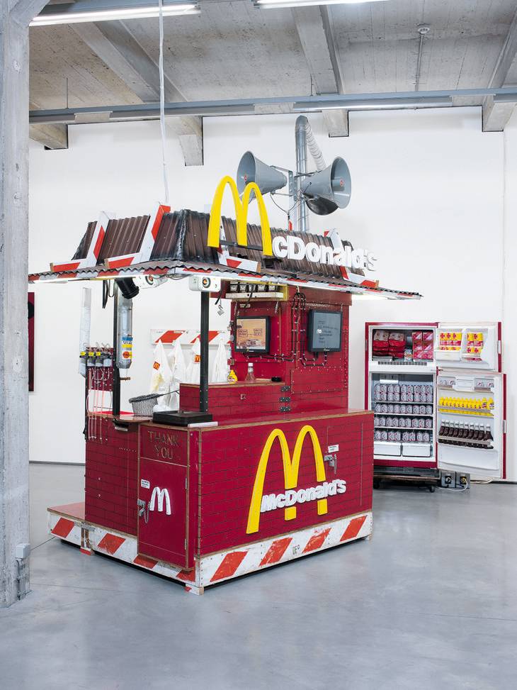
If one were to draw comparisons, Kate Moss is to high fashion of the 1990s as McDonald’s is to the fast food industry of the twentieth century. In 2004, Moss and McDonald’s joined forces in a video by artist Tom Sachs, who documented the supermodel working the counter at a makeshift burger stand, dubbed ‘Nutsy’s McDonald’s’. The short film chronicles Moss completing all stages of the burger-building process, outfitted in a simple white coat with a red and yellow duct tape ‘M’ patch. The food stand in which she cooks was a fully functioning mixed media installation built by Sachs, complete with heat lamps, fry shovel, refrigerator, and a janitors closet.
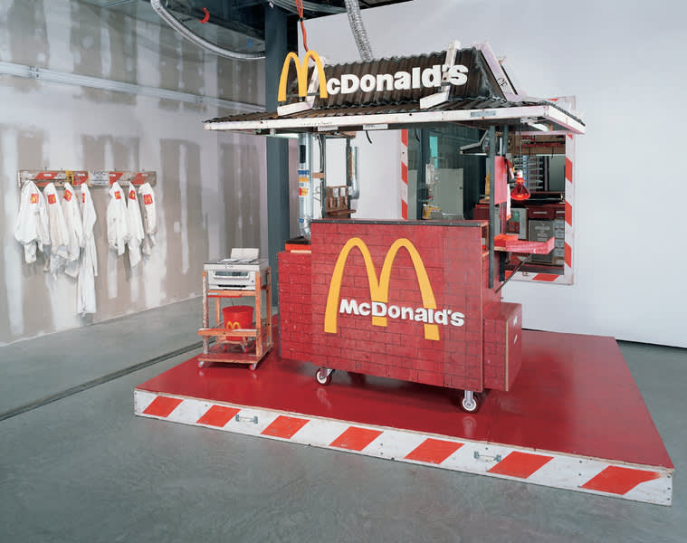
Tom Sachs
Nutsy's McDonald's, 2001
‘Nutsy’s McDonald’s’ is one of many McDonald’s-themed works produced by the American artist; Sachs has utilized the fast food brand’s trademark iconography and menu offerings on plywood paintings, bronze sculptures, boom boxes and a series of ‘Value Meals’ in which he translates high fashion-branded printed materials – from the likes of Hermes, Chanel, Prada and Tiffany – into everyday McDonald’s ‘value meals’.
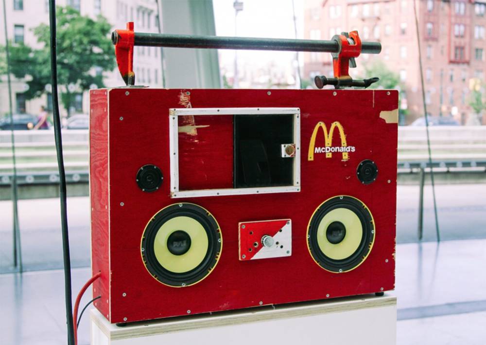
Tom Sachs
McDonald's Boom Box
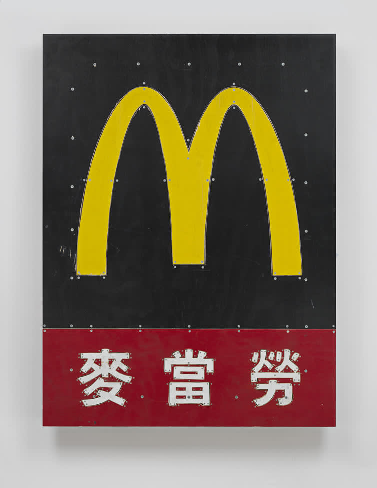
Tom Sachs
McDonald’s, 2013
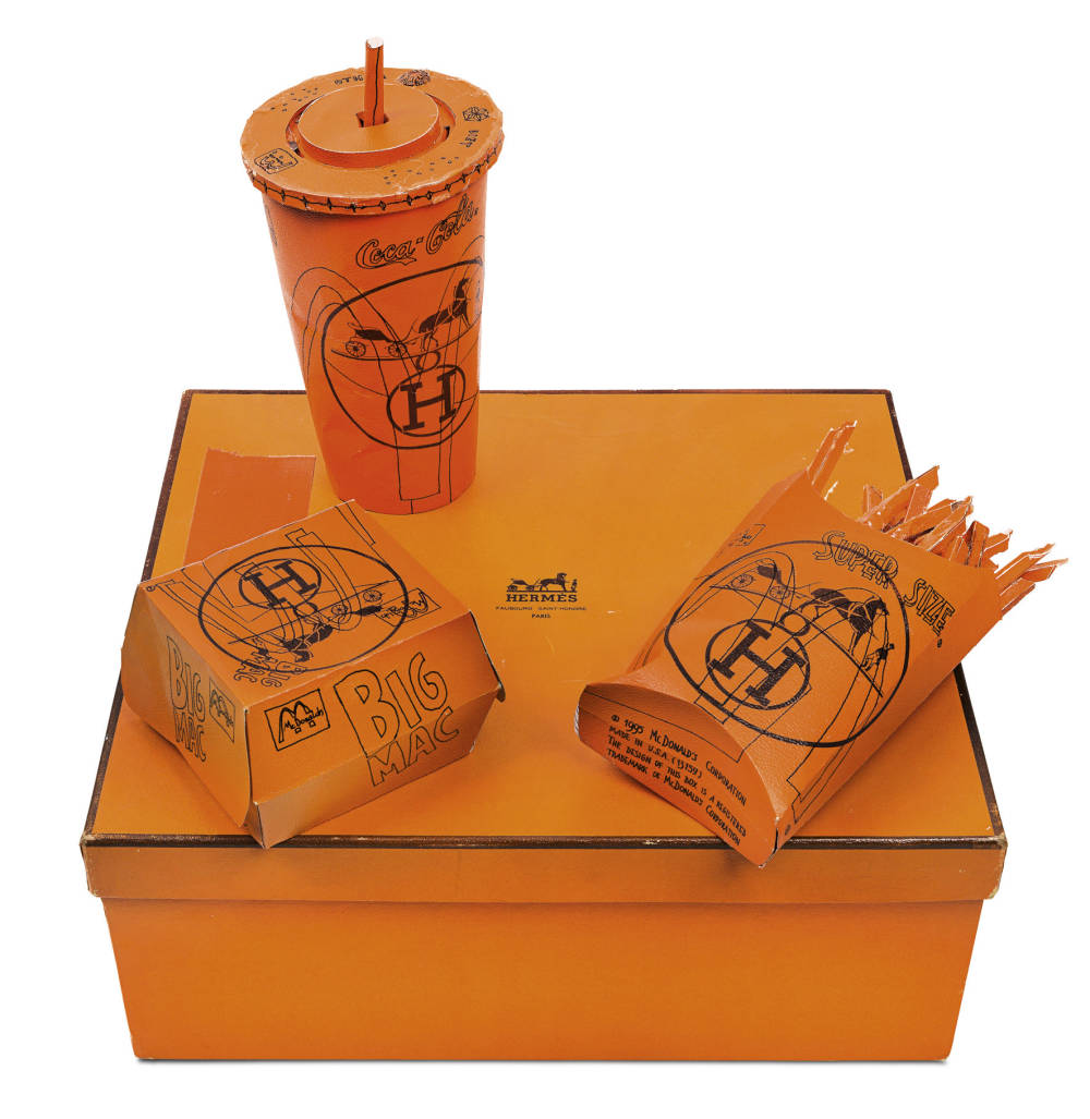
Tom Sachs
Hermés Value Meal, 1997
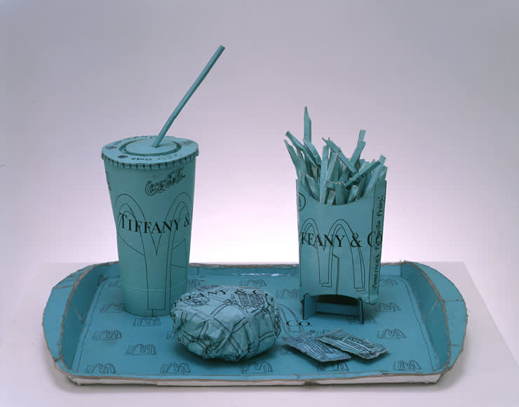
Tom Sachs
Tiffany Value Meal, 2000
From revolutionizing the landscape of mass-produced food through serving the world burger and fries, to forever impacting contemporary culture. McDonald’s inadvertently influenced the trajectory of 20th century architecture, advertising, fashion and fine art, permeating industries outside the realm of fast food through its efficient and highly stylized approach to its craft.