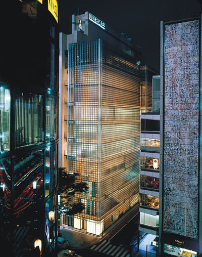
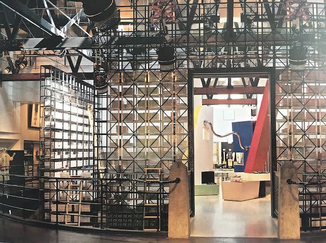
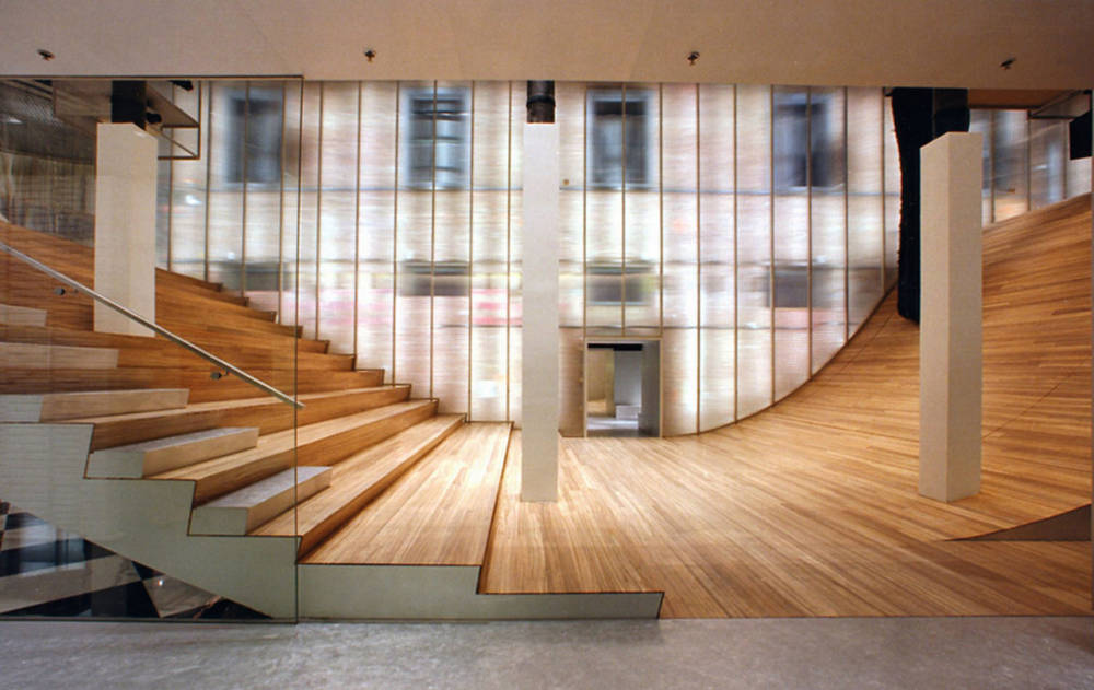
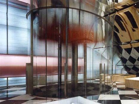
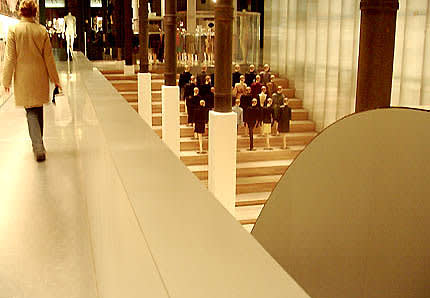
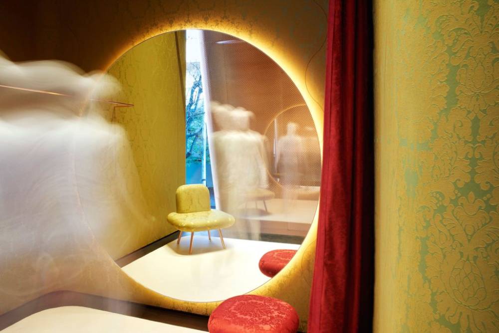
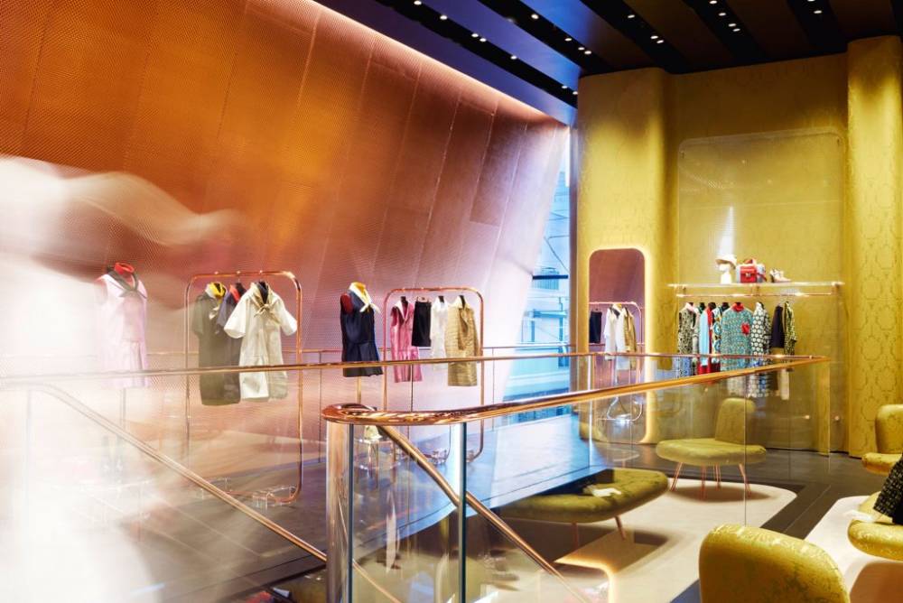
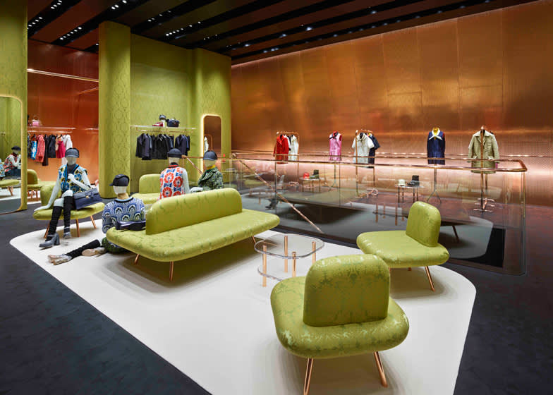
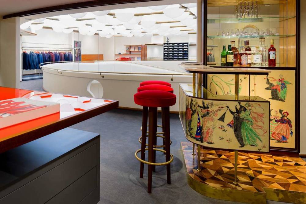
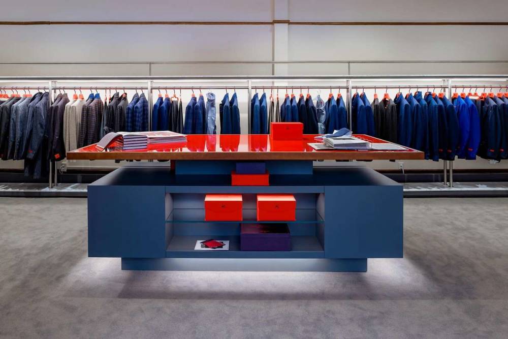
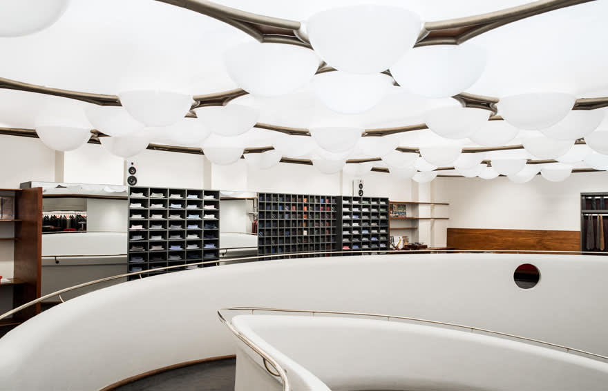
Renzo Piano
Hermès, Tokyo, Japan, 1998-2001
From the beginning of modern commerce, retail and architecture have closely mirrored one another in their growth and progression. Since the arcades of 19th-century Paris first utilized innovative techniques with glass and steel to illuminate products sold in the shops below, architecture and retail have been closely linked. With the addition of the famously grand department stores that grew in the later half of the nineteenth century, the relationship between architects and brands, between architecture and brand identity, was sealed. Architects and brands have continued to work closely with one another through the twentieth-century and into present day.
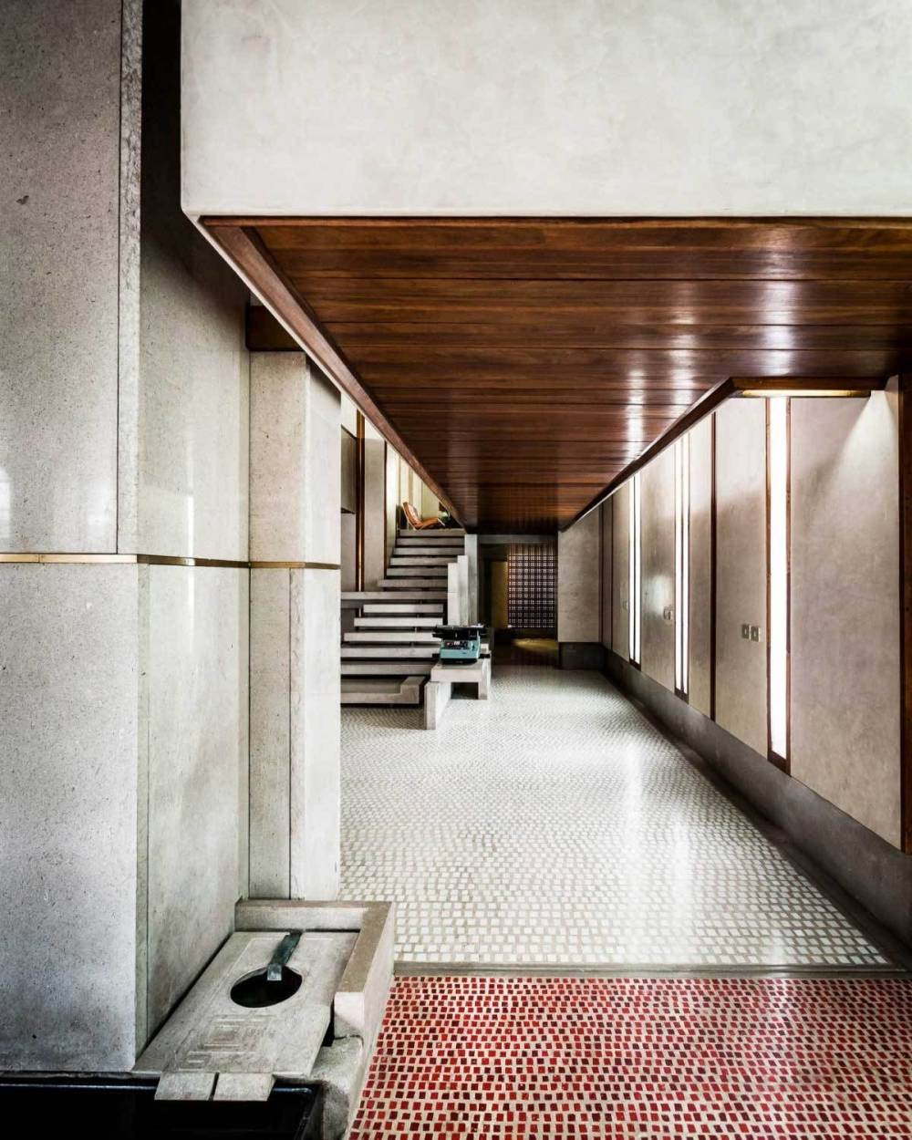
One early example of this collaboration was between men’s clothing store Knize, which opened in Vienna in 1910, and architect Adolf Loos, who later designed stores for Knize in Paris and Berlin. The shop’s facade, which Loos made distinctively smooth and modern, gave the brand a unique identity and staying power. In Paris, the shop walls were made of gray, green, and white striped Cipollino marble, accentuated by black velour carpet and white ceilings. Hanging pendant lamps of glass and brass reflected the design of the display cases, while the store’s wooden tables and chairs were cherry red, and on the second floor, shoppers were surprised with a grand brick fireplace. The contributions of Adolf Loos to Knize’s image were definitive and iconic, and the Vienna store still stands today.
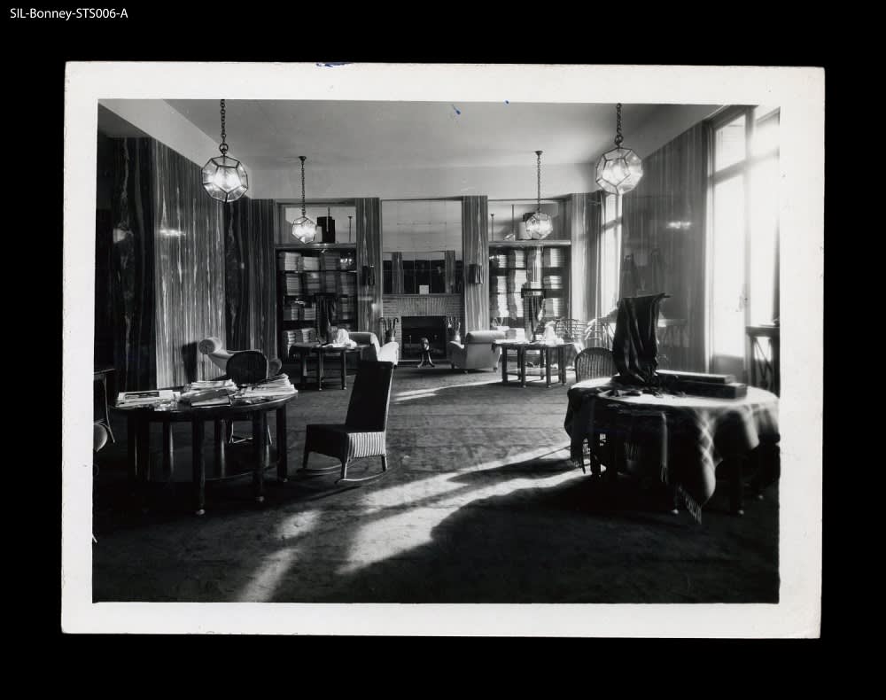
Knize x Adolf Loos
Paris, France, 1927
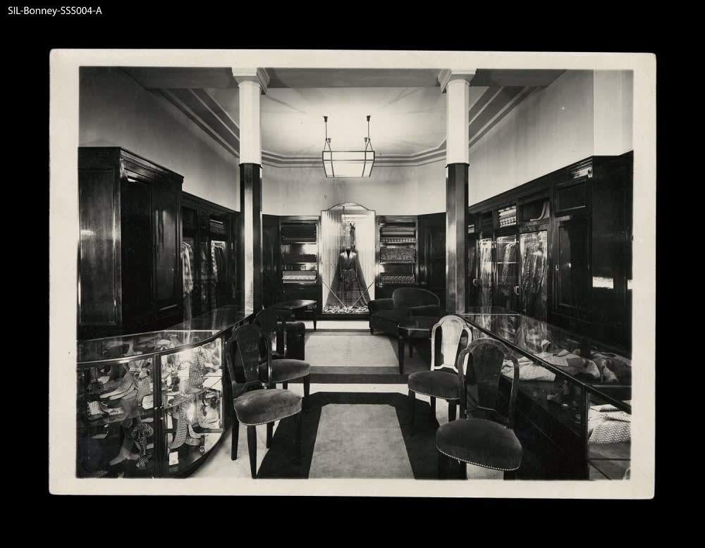
Knize x Adolf Loos
Paris, France, 1927
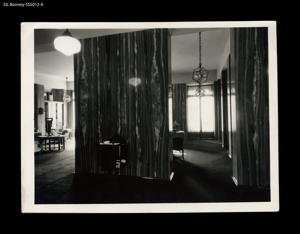
Knize x Adolf Loos
Paris, France, 1927
Another important aspect of brand identity in relation to retail is seen in interior design. Few understood this concept better than architect Jean-Michel Frank, who collaborated with a myriad of brands to help them develop not only a distinguished look, but a distinctive feel for shoppers. In 1925, Frank designed the interior for D’Ahetze, a men’s sportswear shop in Paris, and in 1937, he collaborated with Elsa Schiaparelli on her Place Vendôme perfume boutique. The latter’s stunning interior included a large-scale bamboo birdcage, a reference to the surrealist nature of Schiaparelli’s work and the birdcage in the designer’s Paris living room. Schiaparelli’s clients would no longer just be able to dress and smell the part of Schiaparelli’s modern woman, they could now walk into an immersive experience and actually become part of the brand. Similarly, in 1953, Frank designed a perfume salon for French couturier Lucien Lelong. The shop’s paired down aesthetic stayed true to Frank’s minimalist form, with large blank walls and checkered floors, and boutique also referenced classical Greek and Roman architecture through interior columns, long draping curtains, and apses.
Jean-Michel Frank
Schiaparelli Perfume Boutique in Place Vendôme
Jean-Michel Frank
Schiaparelli Perfume Boutique in Place Vendôme
Yet another aspect of the relationship between brand and retail store is technology. New technology was one of the biggest pulls for customers of the Paris arcades, seen through new age gas lighting techniques that cast products in a luminous glow, and the addition of panoramas to create a spectacle of scenery. Today, new technologies manifest themselves in retail stores in unexpected ways.
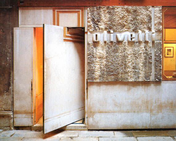
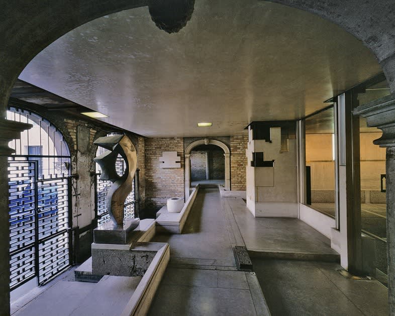
Olivetti, an Italian manufacturer of typewriters, computers, fax machines and other business products, necessarily incorporated the theme of technology in the design of their showrooms. Architect Carlo Scarpa was commissioned to build the Olivetti Shop in Venice in 1957. The retail environment featured a stunning balance of modern architecture and traditional Venetian elements that was considered a masterpiece of contemporary design. The blend of metallic detailing, dynamic glass, and traditional stone created an ethereal and timeless environment within the small space on St. Mark’s Square. In the 1960s, Olivetti opened a showroom in Paris and shops in both the French capital and Buenos Aires. Designed by architect Gae Aulenti, the showrooms borrowed ideas from the piazza with various levels of platforms and steps, creating unique environments and opportunities for storytelling. The placement of the Olivetti technology within the space of the piazza — a city-planning tradition that has existed since ancient times — established Olivetti products as something eternal, while rounded corners and colorful details added elements of 1960s design. The shop in Paris borrowed these concepts, becoming an extension of the showroom itself, while in Buenos Aires, Aulenti took an even more experimental approach, with beams covered in plastic laminate exploding from the outer corner of the shop onto the street like rays of light, accentuated by mirrors across the walls and ceiling.
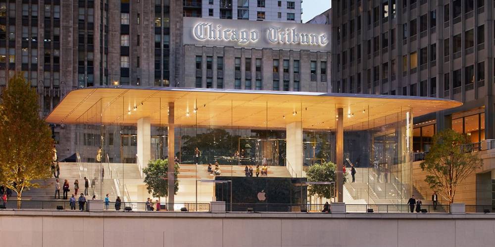
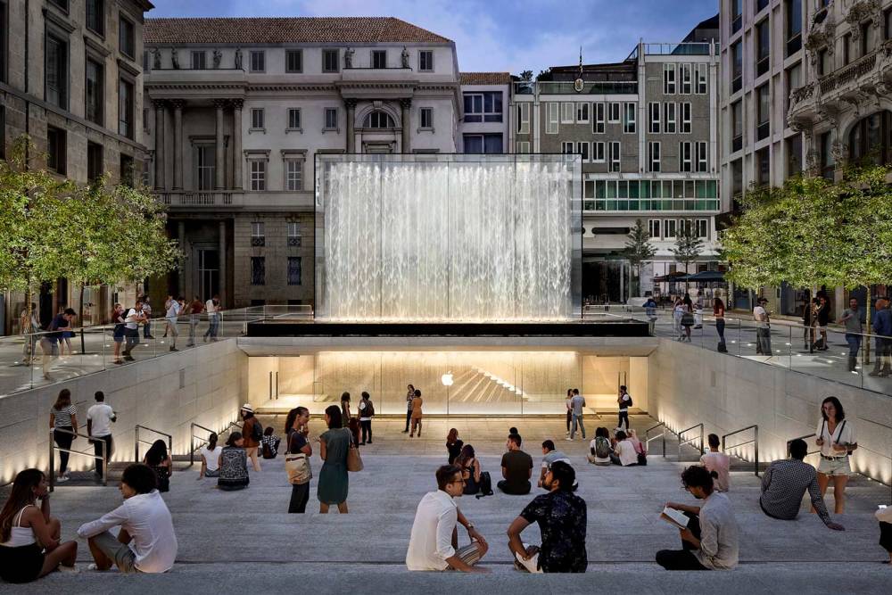
A modern version of the genius collaboration between Olivetti and its architects is seen in the design of Apple’s retail stores. The Apple Store has become a universally recognizable space of light-filled modern architecture, thanks in large part to the London-based architectural firm Foster + Partners. The use of dynamic glass to create feelings of open-air environments centered on technology ties effortlessly into Apple’s brand identity as forward-thinking creators of the future.
Carlo Scarpa
Olivetti Showroom, Venice, Italy
Carlo Scarpa
Olivetti Showroom, Venice, Italy,
Carlo Scarpa
Olivetti Showroom, Venice, Italy
Gae Aulenti
Olivetti Showroom, Paris, 1966
Gae Aulenti
Olivetti Shop, Paris, 1967
Gae Aulenti
Olivetti Showroom, Buenos Aires, 1968
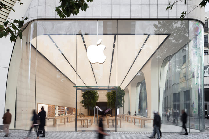
Foster + Partners
Apple Store, Brussels
Foster + Partners
Apple Store, Chicago
Foster + Partners
Apple Store, Milan
In understanding the importance of architecture and design in deepening a brand’s identity and ability to connect with its consumers, fashion houses from around the world have historically partnered with a wide range of architects to create innovative retail spaces.
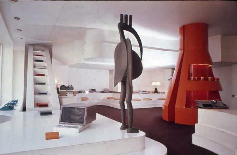
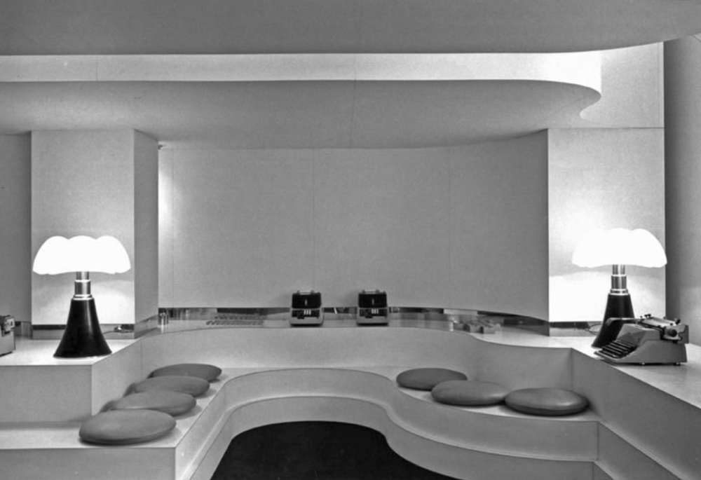
In the 1970s, Italian architect Ettore Sottsass became bored with the minimalist aesthetic that dominated design of the time. As such, Sottsass’ trademark style of bright colors, geometric patterns, and textures became a distinctive marker of the latter decades. So much so that in the 1980s athletic clothing company Esprit hired Sottsass to create bold, colorful retail environments that matched the brand’s distinctive aesthetic. Soon after, Esprit became as widely known for their over-the-top stores as for their athletic designs and iconic logo.
Japanese industrial designer Shiro Kuramata also worked on a variety projects for the brand, including stores in Tokyo, Singapore, and Hong Kong. The designs utilized high ceilings and see-through dividers as well as colorful walls and innovative details. In 1982, Kuramata created the Esprit House in Tokyo, built out with stunning floor-to-ceiling windows and terrazzo flooring, and staged with custom terrazzo tables and two unique sofas. Another prominent client of Kuramata’s was fashion designer Issey Miyake, for whom he designed two stores in Tokyo and ‘shop-in-shops’ around the world. The designs were each unique, but utilized similar finishes and many of the same architectural details, such as contrasting horizontal lines and bright lighting.
Ettore Sottsass
Esprit Store, 1985
Ettore Sottsass
Esprit Store, 1985
Ettore Sottsass
Esprit Store, 1985
Ettore Sottsass
Esprit Store, 1985
Shiro Kuramata
Esprit House, Tokyo, 1983
Shiro Kuramata
Esprit House, Singapore, 1986
Shiro Kuramata
Esprit House, Singapore, 1986
Shiro Kuramata
Esprit House, Hong Kong, 1983
Shiro Kuramata for Issey Miyake
Bergdorf Goodman, New York, New York
Shiro Kuramata for Issey Miyake
Seibu Department Store Amagasaki Kinki Japan, 1985
Shiro Kuramata for Issey Miyake
Issey Miyake store in Ginza, Tokyo, 1983
Also located in Japan, the luxury shopping complex Ginza Six was designed by architect Yoshio Taniguchi. Traditional Japanese fabric dividers were used as inspiration for the store, which can be seen in the shop’s staircases, railings, and patterned glass ceiling. In lieu of a traditional storefront, Taniguchi invited the luxury brands on the located on ground level — Dior, Céline, Yves Saint Laurent, Van Cleef & Arpels, Valentino, and Fendi — to design their own interpretations of the building’s main facade.
Most recently, in New York City artist Sterling Ruby, known for his large-scale installations and work in sculpture, collaborated with Raf Simons to re-imagine Calvin Klein’s Madison Avenue flagship, originally designed by architect John Pawson in 1996. Ruby’s floor-to-ceiling overhaul incorporated bright yellow walls, vibrant interior scaffolding, balls of yarn and colorful fringe, to create an immersive installation for shoppers playing on an Americana theme that spoke to Calvin Klein’s brand philosophy.
Sterling Ruby x Calvin Klein
Calvin Klein, New York City flagship
Sterling Ruby x Calvin Klein
Calvin Klein, New York City flagship
Sterling Ruby x Calvin Klein
Calvin Klein, New York City flagship
Yoshio Taniguchi
Ginza Six, Tokyo
Yoshio Taniguchi
Ginza Six, Tokyo
Yoshio Taniguchi
Ginza Six, Tokyo
Meanwhile in Los Angeles, New York-base fashion brand The Row designed a flagship store with international architecture firm Montalba Architects. The boutique uses California Modernism as inspiration to create a fluid dialogue between the retail space and the shop’s outside environment. The interior feels more like a beautiful west coast residence than a traditional store, with floor-to-ceiling glass doors and windows, a central courtyard, fireplaces and multiple seating vignettes – curated with an ever-changing selection of midcentury furnishings to compliment the season’s fashion and accessories. A 25-foot skylight allows natural light to flood the space, while walnut display pieces decorate the hallways alongside greenery and vegetation. The store’s subtle design is the ideal physical embodiment of the brand, perfectly echoing the easygoing yet elevated aesthetic their customer’s have gown to adore.
Likewise, the brand’s Jacques Grange-designed New York City flagship pays similar homage to the city in which it lives. Set in an Upper East Side townhouse, the store’s three expansive floors utilize luxurious textiles, neutral flooring, white plaster walls and museum-quality 20th century design to create an environment that allows product to shine and makes shoppers never want to leave. Meanwhile, having just opened this month, the brand’s first international flagship in London’s Mayfair neighborhood inhabits an old bank building restored by German-born, New York-based architect Annabelle Selldorf. Rich with heritage, the store combines original finishes with modern design elements that, like The Row’s collections, create a thoughtful dialogue between past and present.
Montalba Architects
The Row, Los Angeles
Montalba Architects
The Row, Los Angeles
Montalba Architects
The Row, Los Angeles
Jacques Grange
The Row, NYC
Jacques Grange
The Row, NYC
Jacques Grange
The Row, NYC
Jacques Grange
Jacques Grange, The Row, NYC
Annabelle Selldorf
The Row, London
Annabelle Selldorf
The Row, London
Annabelle Selldorf
The Row, London
Annabelle Selldorf
The Row, London
The Office for Metropolitan Architecture, otherwise known as OMA, founded in 1975 by Rem Koolhaas, is a Dutch architectural firm known worldwide for their retail work, even as a small branch of their overall practice. OMA’s brilliance in the field of retail design exists in their understanding of a store’s layout and functionality to better suit the needs of the customer; a philosophy that guided their work with Italian jewelry house Repossi on the brand’s 2016 Paris flagship at Place Vendôme. The store is divided into three distinct spaces: the street, gallery, and salon. As such, the retail space explores different methods of shopping, each one corresponding to a space: fast, slow, and very slow, allowing shoppers to tailor their experience to their individual needs and desires. In the design, architecture is used as both a means of curating one’s visit and a medium on which to stage jewelry, including built-in shelves and modern displays.
Rem Koolhaas
Repossi Paris Store
Rem Koolhaas
Repossi Paris Store
Rem Koolhaas
Repossi Paris Store
Rem Koolhaas
Repossi Paris Store
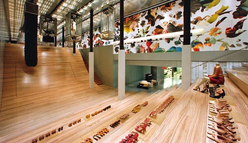
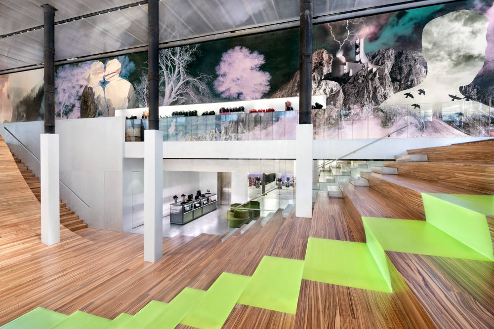
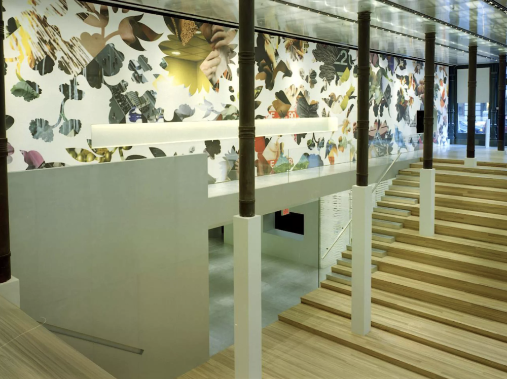
Among the most iconic examples of OMA’s work in fashion are results of their ongoing collaborative relationship with Italian fashion house, Prada. Almost two decades ago Prada opened the New York Epicenter, a multi-functional retail environment that serves as an exclusive boutique, a think lab, a public arena, a gallery, and a performance space. With a large central ‘display wall,’ covered in rotating imagery spanning the length of the store, and a curving slope on the main level called ‘The Wave,’ leading shoppers to the basement, the Epicenter also boasts a convertible stage and seating area that can double as a display for product, and traditional retail spaces hidden below. Other details add to shopper’s unique experience, such as a button that turn the glass fitting room doors from transparent to opaque, video projections, a circular glass elevator, and movable hanging metal cages. In developing the space, OMA took cues from the changing nature of modern retail to inform its design decisions, creating a unique environment that is able to easily adapt with the times. Almost twenty years later, Prada’s New York Epicenter is still a daring experimentation in how a modern retail space can and should function.
Rem Koolhaas
New York's Prada Epicenter
Rem Koolhaas
New York's Prada Epicenter
Rem Koolhaas
New York's Prada Epicenter
Rem Koolhaas
New York's Prada Epicenter
Rem Koolhaas
New York's Prada Epicenter
Rem Koolhaas
New York's Prada Epicenter
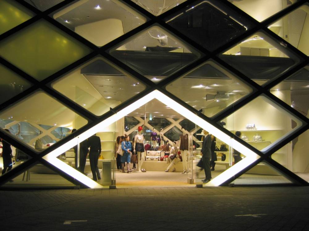
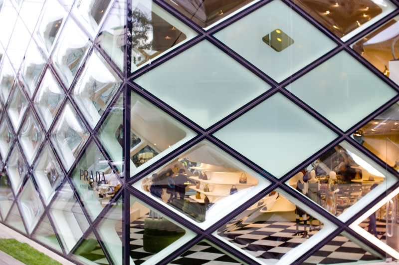
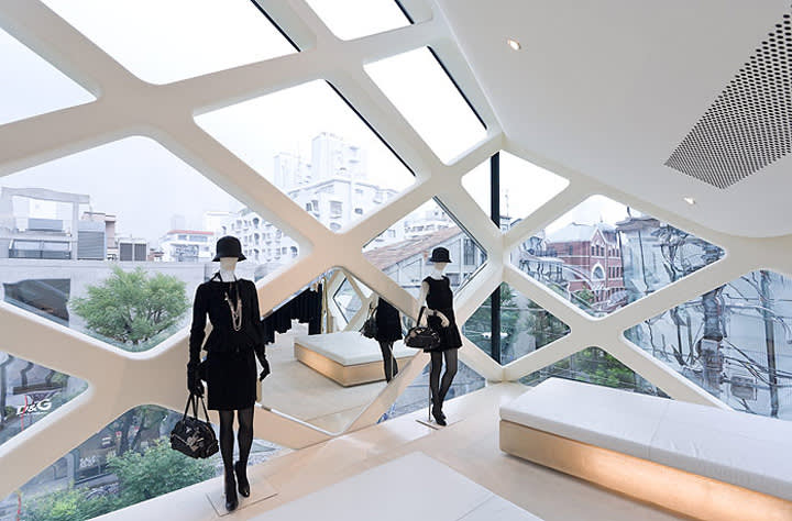
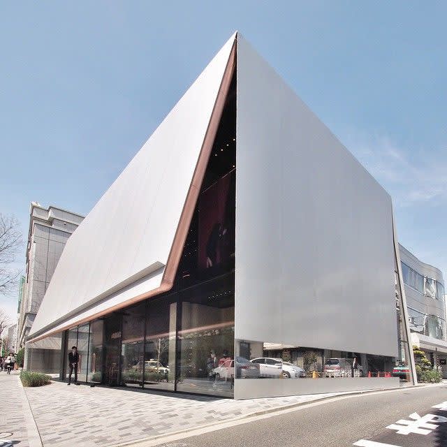
Yet another revolutionary approach to fashion retail is seen in Prada’s Tokyo Epicenter. Designed by Swiss architecture firm Herzog & de Mueron, the space similarly meshes consumption with entertainment and communication. The six-story building is asymmetrical, its five sides covered by diamond-shaped glass panels that alternate between concave, convex, and flat surface treatments, giving a unique experience to both the shopper and the passerby. In exploring the building, you see the products on display from different perspectives through the warped façade. Herzog & de Mueron also collaborated with Miuccia on the Tokyo store for her other line, Miu Miu, located across the street in the city’s Aoyama district. The building’s opaque facade is in contrast to the all-glass Prada building, with an oversized canopy creating a homey, hidden environment that resembles an upside-down open box; its cover open slightly to allow shoppers to peek inside at the front and on the back corners. The exterior is striking, and leads to an interior of quintessential Miu Miu brocade and brass-colored metal.
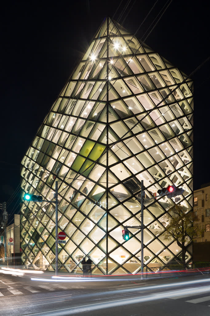
Herzog & de Meuron
Prada, Tokyo
Herzog & de Meuron
Prada, Tokyo
Herzog & de Meuron
Prada, Tokyo
Herzog & de Meuron
Prada, Tokyo
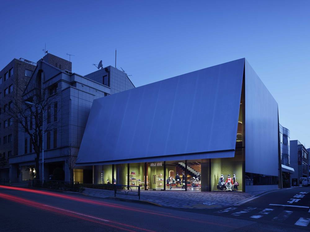
Herzog & de Meuron
Miu Miu, Tokyo
Herzog & de Meuron
Miu Miu, Tokyo
Herzog & de Meuron
Miu Miu, Tokyo
Herzog & de Meuron
Miu Miu, Tokyo
Herzog & de Meuron
Miu Miu, Tokyo
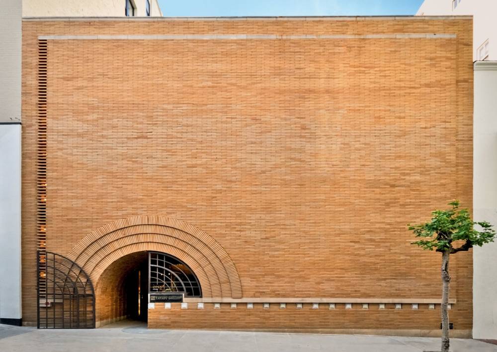
In lieu of collaborating with architects, brands can also make existing architectural designs work for their image. In 1948, the Italian menswear brand ISAIA opened a boutique in Frank Lloyd Wright’s V.C. Morris Gift Shop in San Francisco. No alterations are allowed to the interior, so the original cabinets as well as antiques from the gallery designed by Wright remain in the store. The unique facade contains a huge arched doorway, while the interior has a central “void,” with a spiraling ramp surrounded by clothing displays and accessories placed in its center.
In each of these cases, the task of forging a relationship between the shopper and the brand falls to the store’s design. In its architecture and interior, a store can relay its aesthetic and message to the world and create a deeper, more meaningful experience for the shopper. Since the beginning, architecture and retail have gone hand in hand, and even though today sees the decline of the brick and mortar store, the innovative work of architects will continue to push retail into the future.
Frank Lloyd Wright
ISAIA, San Francisco
Frank Lloyd Wright
ISAIA, San Francisco
Frank Lloyd Wright
ISAIA, San Francisco
Frank Lloyd Wright
ISAIA, San Francisco

Frank Lloyd Wright
ISAIA, San Francisco